
|
www.riscos.com Technical Support: |
This chapter describes how an application (!Hyper, which can be found in the Examples directory) was designed with Acorn C/C++. In particular it demonstrates how using !ResEd and !ResTest can lead to very short design times. The first section describes how to use !Hyper, and the second section is a description of how it was designed and implemented.
!Hyper is a multi-document viewer for HCL files (see HyperCard Control Language for the syntax). HCL files define stacks of cards allowing multiple Draw objects to be linked such that a user may click on active areas (called hot spots) of a viewer to navigate between different cards. Only one card from a stack is visible at any time in a viewer, although being multi-document, !Hyper may display several views onto the same stack, each of which may be displaying a different card.
!Hyper is started by double-clicking on its application icon or by double clicking on an HCL file (but only after !Hyper has been seen by the Filer).
Clicking Menu over the application icon will display the following menu:
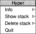
Info leads to a standard program information dialogue box.
Show stack allows any closed viewers to be reopened or brings to the top an already opened one.
Delete stack will remove it from memory.
Note that if no stacks have been loaded then the show stack/delete stack will be greyed out.
Quit will exit the application.
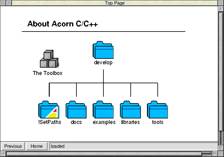
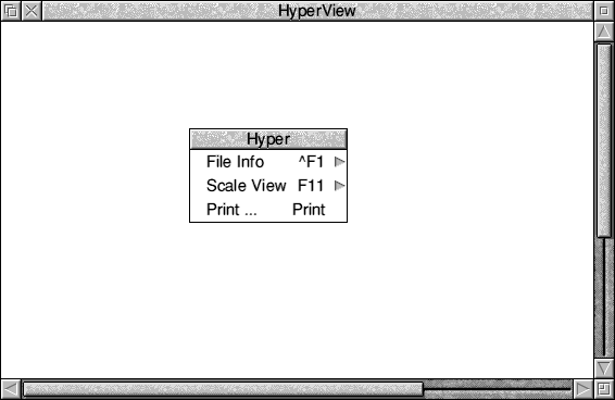
Once a stack has been loaded, !Hyper will open a viewer displaying the 'Home Card' of that stack. For example:
The user can move from one card to another by clicking on hotspots. Hot Spots will usually be identifiable in some way, though !Hyper will change the pointer shape whilst it is over one. It is also possible to jump to the Home Card or back to the previous card by clicking on the action buttons in the status area at the bottom of the window.
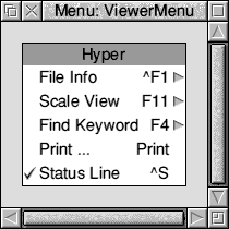
Pressing menu over a viewer window will display the following menu:
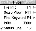
This allows various operations to be performed on the stack being displayed:
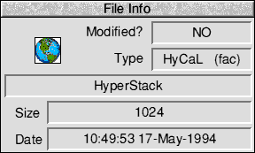
File Info displays information about the file.
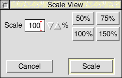
Scale View leads to a standard scale dialogue box which lets the user zoom in and out on a card.
Find Keyword allows searching for keywords that are stored in the stack. This allows an index type search to be applied.
Print... allows the current card to be printed.
Status Line controls whether or not the status area is to be displayed at the bottom of the viewer window.
Clicking in a viewer gives it the keyboard input focus. This then allows various keyboard short-cuts to work. The standard keys for Find Keyword, Scale View, File Info and Print... all work (as can be seen from the menu, pictured above) as well as p and h for previous and home.
It is worth having !Hyper at hand whilst reading this section. Loading its resource file into !ResEd and !ResTest will make it easier to see the various linkages between objects and observe the events that are raised when interacting with the user interface. The chapters later in this manual give full information on each of the classes involved.
Before designing the structure of !Hyper we had to decide what it must be able to do. We wanted to design a HyperCard-type application with the following features:
From the required features, we made the following design decisions.
The multi-document support suggested the use of shared objects and the use of client handles for maintaining what file the viewer was showing. By doing this we would reduce memory usage (by just having one copy of the shared menus and dialogues) without complicating the association between events on a menu and the viewer that it was opened from.
Given that we wanted to extend and modify the interface easily, we decided to make it event driven as opposed to object driven. In other words when registering event handlers, we register for specific event numbers, rather than a generic event (e.g. ActionButton_Selected) on a specific component of an object. In this way we are able to modify the interface (e.g. reorder a menu or even move menu entries off onto a submenu) without having to change the code.
We also decided to take advantage of a number of features offered by the toolbox such as the 'About To Be Shown' events. These made it possible to set up dialogue boxes as they were being shown, and not have to update them constantly as other parts of the application altered data. A less obvious benefit of this mechanism is that since the toolbox tells us the object id of what is being shown, we do not have to remember this ourselves, and in fact it is possible to let the toolbox automatically create such objects.
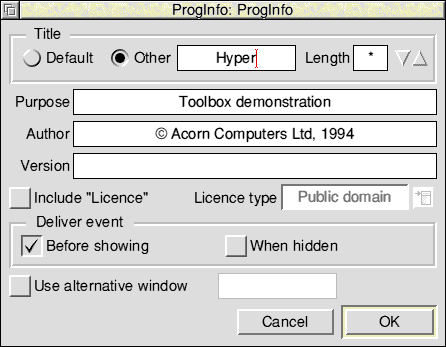
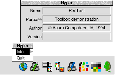
A good example of this is the Program Information box. This is created by the toolbox as a side effect of creating the iconbar (which is created on initialisation due to it having its AutoCreate bit set). We then just need to register for the ProgInfo_AboutToBeShownEvent and in our handler set the version string from our message file.
To be Style Guide compliant (and to make less work for ourselves) we can use the standard PrintDbox, Scale, ProgInfo and FileInfo object templates supplied by the Toolbox.
As we want !Hyper to be keyboard drivable, we can make use of the Toolbox's keyboard short-cuts facility.
The rest of this chapter takes you through the stages involved in implementing !Hyper. It breaks down into the following sections:
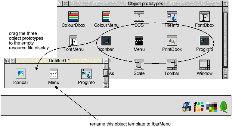
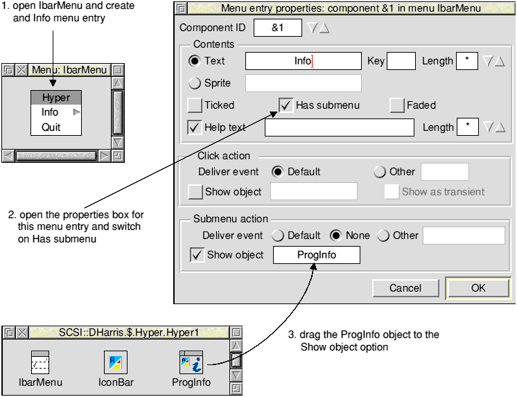
The first stage in implementing !Hyper was to create and test a very simple resource file consisting of an IconBar object template, a Menu object template for the iconbar icon, and a ProgInfo object template.
The Info entry we edited to include a submenu option to display the ProgInfo object template:
The Quit entry was edited to return a particular event:
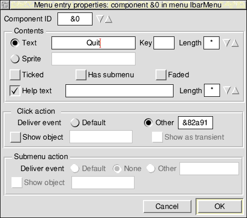
As we could choose our own events, the choice of 82a91 may seem strange. However, this is the same event that is generated by the Quit dialogue class, hence if we added editor features and required a quit confirmation, we could still use the same handles.
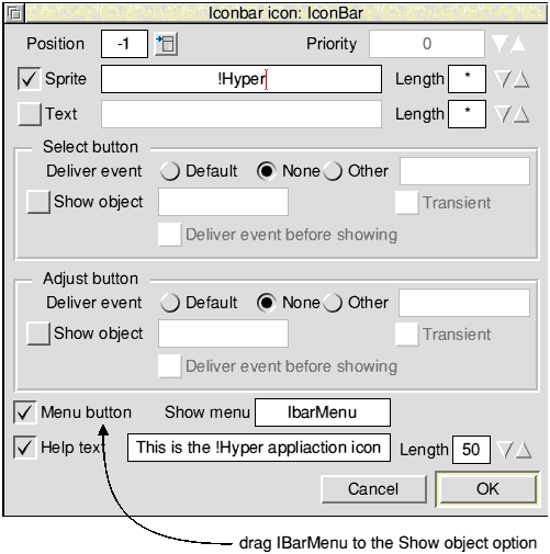
To test out this initial design we dragged the resource file from !ResEd to !ResTest's iconbar icon (ResTest is described on ResTest). As we had set the AutoCreate and AutoShow options for the iconbar object template, it appeared immediately on the iconbar. Pressing Menu over the icon opened our menu (IbarMenu) with the Quit and Info options. Sliding the mouse pointer over the submenu arrow opened the ProgInfo box:
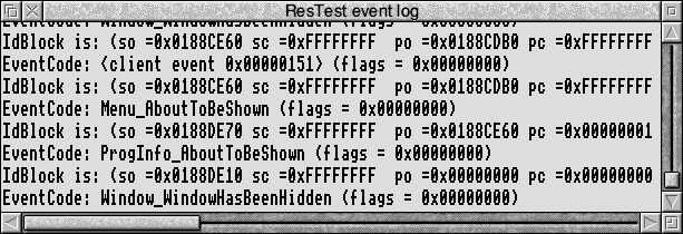
Clicking on !ResTest's iconbar icon opened its Event Log window. We could now see what events were being raised when we tested the interface:
We could now start writing some code. Being event driven, we decided to use eventlib. Our initial code merely consisted of initialising the Toolbox and eventlib and then registering our handlers. At this point we just needed some quit handlers (for the event generated by the Quit menu option and for the Wimp messages) and a handler to fill in the version string on the ProgInfo box.
Note the use of wimplib to provide easy access to the Wimp SWIs.
(from main.c)

static void app_init(void)
{
  /* initialise as a toolbox task */
  _kernel_oserror *e;

  if ((e = toolbox_initialise(0, 310, messages, tbcodes, "<Hyper$Dir>", &mbl,
                              &idblk, 0, 0, 0)) != NULL) {
    wimp_report_error(e, 0, 0, 0, 0, 0);
    exit(1);
  }

  /* initialise event lib */

  event_initialise(&idblk);

  /* not interested in nulls or keypresses- the toolbox handles all our
     keyboard shortcuts */

  event_set_mask(1 + 256);

  /* register events */

  event_register_message_handler(Wimp_MQuit, quit_handler, 0);

  event_register_toolbox_handler(-1, Quit_Quit, tbquit_handler, NULL);
}

(from handler.c)

int tbquit_handler(int event_code, ToolboxEvent *event, IdBlock *id_block,
                   void *handle)
{
  IGNORE(event);
  IGNORE(event_code);
  IGNORE(handle);
  IGNORE(id_block);

  quit = 1;
  return 1;
}

int quit_handler(WimpMessage *message, void *handle)
{
  IGNORE(message);
  IGNORE(handle);

  quit = 1;
  return 1;
}

int proginfo_show(int event_code, ToolboxEvent *event, IdBlock *id_block,
                  void *handle)
{
  IGNORE(handle);
  IGNORE(event);
  IGNORE(event_code);

  proginfo_set_version(0, id_block->self_id, lookup_token("Version"));
  return 1;
}
Next we turned our attention to file loading. This involved coping with DataOpen messages on HCL files and files that are dragged to the iconbar icon. To do this we registered some more Wimp message handlers.
(from main.c)
  event_register_message_handler(Wimp_MDataOpen, file_loader, 0);
  event_register_message_handler(Wimp_MDataLoad, file_loader, 0);

(from file.c)
int file_loader(WimpMessage *message, void *handle)
{

  WimpMessage msg;
  IGNORE(handle);

  /* only interested in HCL files */
  if (message->data.data_open.file_type != 0xFAC)
    return 0;

  msg = *message;
  msg.hdr.your_ref = msg.hdr.my_ref;
  load_hcl_file(msg.data.data_load_ack.leaf_name);
  if (message->hdr.action_code == Wimp_MDataLoad)
    msg.hdr.action_code = Wimp_MDataLoadAck;
  wimp_send_message(Wimp_EUserMessage,&msg, msg.hdr.sender,0,0);

  return 1;
}
Now it was time to open a viewer onto a file. This involved going back to our resource file and adding some more object templates:
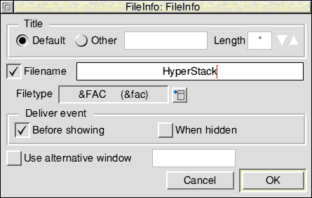
The dialogue box for FileInfo we filled in as follows (note that we switched on Deliver event Before showing):
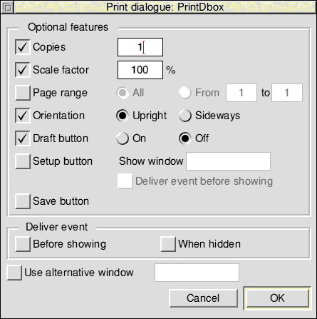
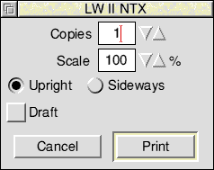
The dialogue box for Print we filled in as follows:
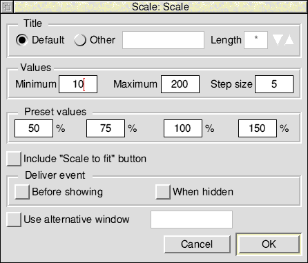
We changed the default values in the dialogue box for Scale as follows:
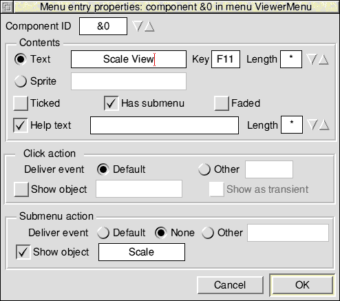
We then edited ViewerMenu, dragging the above three object templates to the Show object options in the appropriate Menu entry properties boxes.
For example, the Scale View Menu entry properties box:
Having filled in all three menu entries, we then edited the HyperViewer window object template. We dragged ViewerMenu to the Show menu field, and filled in the other window properties boxes as appropriate.
Note that, to receive redraw events, we switched off the Auto-redraw flag in the Other properties dialogue in the HyperViewer window. This will affect the appearance in !ResTest and so, for the purposes of this demonstration, is left on.
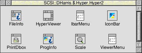
Our resource file display now looked like this:
After connecting them we dragged the resource file to !ResTest. Our icon appeared on the iconbar as before, but now when we pressed Menu over !ResTest's icon and looked at the Create submenu, we saw all the new object templates that we added.
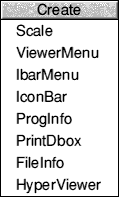
We then clicked on HyperViewer to create a viewer. This also unfaded the Show option and allowed us to go into the Show submenu and see all the object ids that had been created:
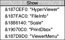
The Show submenu has three columns:
When we clicked on the HyperViewer entry in the Show submenu the viewer was displayed on the screen. As a side effect of the creation the menu tree for the viewer was created as well. Pressing Menu over the viewer displayed the menu as one would expect:
Moving the pointer over the submenu arrows displayed the File Info and Scale View dialogue boxes:
Clicking on Print ... displayed the Print dialogue persistently:
The code to support these new features can be found in the C files under the !Hyper directory of the examples. As with the code fragments above, they take the form of registering a handler for a specific event in app_init (e.g. FileInfo_AboutToBeShown) and then handling the event elsewhere. Note that the print code is an essentially standard print job/render loop, differing only in that it uses the DrawFile module to do the rendering. See print.c for more information on this.
For the viewer (see view.c) we create a window object from a template (called HyperView, as seen in the !ResTest menu) and attach various handlers to cope with RedrawRequests and CloseWindow requests. Note that there is no need to register for OpenWindow requests as this is done on our behalf by the toolbox (as we set the AutoOpen bit of the window's template). We also register for mouse click events on the window. The relevant handler (click_viewer) sets input focus to the window and if applicable jumps to a new card.
The redraw handler (in draw.c) is a standard Wimp redraw handler that uses the DrawFile module to render into the window. Note that the DrawFile module is a generic renderer (i.e. not Wimp specific) and so needs absolute coordinates and a transformation matrix. We use the latter in the simplest sense - just as a way of scaling the Draw files.
The scaling is set whenever the user clicks scale on the Scale box. If you have the !ResTest Event log window open with the Resource file loaded, you will see that a 'Scale_ApplyFactor' event is generated. We use this in a handler (in draw.c) to adjust the transformation matrix.
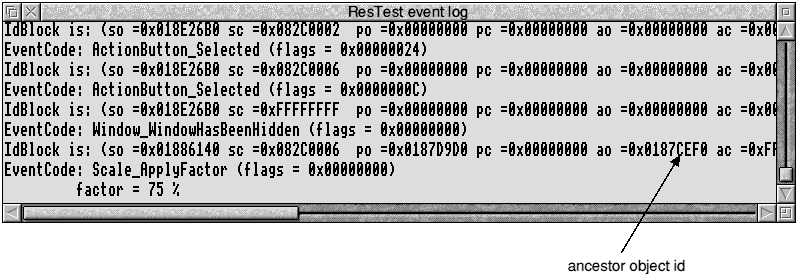
The object id for the ancestor of the Scale_ApplyFactor event in this example is &187CEF0. This equates to the object id of HyperViewer (as shown in the Show submenu). This is because the viewer is the ancestor of this menu. The usefulness of this becomes apparent when more than one viewer object is shown.
To implement the hotspots on a view, we add gadgets (components of a Window Object) to our viewer window. We use the simplest gadget type, a button gadget, which is quite close in functionality to a Wimp icon (see button.c). Rather than hard code the definition of the gadget into the code, Window_ExtractGadgetInfo is used to get the basic gadget definition from a window template called 'Properties'.
Not surprisingly, we link all the data structures for the loaded files together on a linked list. However, we do not need to search down this list every time an event happens: by using client handles (see view.c) we can attach the address of the relevant structure to an object. In this way, when we get a redraw event, we just find out the client handle of the viewer on which it happened and can determine what Draw files are to be rendered.
This also works for the menu tree; even though we are sharing the menu tree amongst all the open views, the IdBlock that initialised the toolbox is filled in with the ancestor of the tree. In Hyper, that will be a viewer (we set the Ancestor bit of the HyperView template). So, for example, when we receive a Scale_ApplyFactor event (as in Scaling), the ancestor is the viewer that leads to the scale object being shown. This also applies to PrintDboxes, even though they are shown persistently.
As we want a history of all views, we build a 'Views' submenu which will be off the icon bar menu. In common with other applications we want the ability to show a view and remove one from memory. In both cases the list of views is the same. This allows us to take advantage of shared objects again. We just need one menu that we build up entry by entry and make this a submenu of the 'Remove View' and 'Show View' entries that are added to the iconbar menu. When an event happens on this menu, we just need to find out the parent component (from the IdBlock) to determine whether we are removing or showing a view. We can also use another useful toolbox feature, in that it is the client that chooses the component ids. This means we can choose the address of the structure that defines a view as its component id - allowing very easy association between the menu entry and the view it refers to. Note that by having an about to be shown event enabled for the iconbar menu, it was possible to fade or unfade the 'Show view' and 'Remove view' entries as required (simply by checking whether our linked list was NULL).
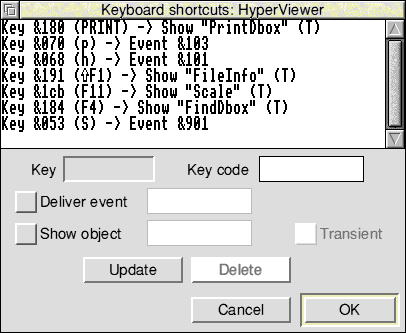
With the interface beginning to stabilise, it was possible to start adding some of the keyboard short-cuts. These were generally decided by the Style Guide (e.g. F11 for scale), though some aspects of the interface required keys specific to Hyper (e.g. previous and home) to generate events. All this was handled through !ResEd (using the keyboard short-cuts option from the window object template menu) without any additional code requirement.
A status bar was also provided by creating a Toolbar containing a button gadget:

This Toolbar object template was then dragged to the Toolbars dialogue box from the HyperViewer window:
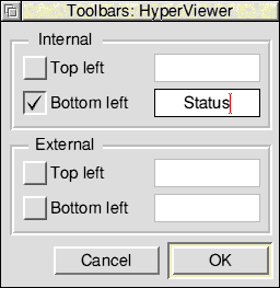
By using an internal bottom left toolbar, the parent window could be resized whilst still allowing the status to be visible. Previous and home action buttons were added (generating the same event codes as the keyboard short-cuts, so no additional code was required) as well.

To control the visibility of the status bar, a menu entry (and appropriate keyboard short-cut) was added that would tick according to whether the status was showing. The handler for this is in handler.c. Note that since the status is on a per-viewer basis, we need to know when the viewer menu is opened (and over what viewer) to determine whether the option should be ticked or not.
Finally, to provide a find capability, a custom dialogue was designed using !ResEd starting from a basic Window and adding gadgets from the gadgets window:
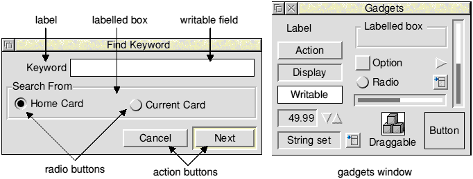
The properties dialogues for the two action buttons were:
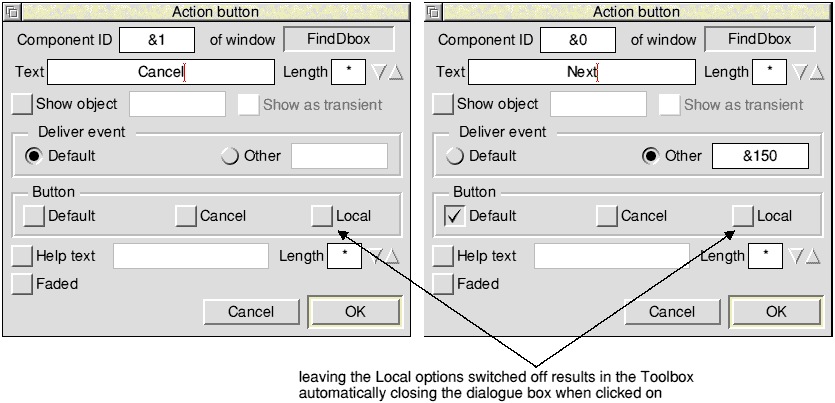
The Next action button was made the default and assigned a specific event code.
The Home Card radio button properties dialogue was filled in as follows (this radio button was specified as the selected radio button):
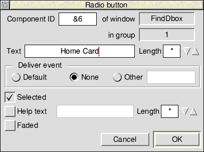
The Current Card radio button properties dialogue was edited to be similar to the Home Card radio button, except that it was not specified as the selected radio button.
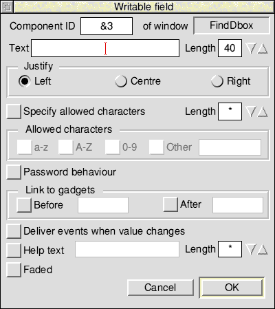
The Keyword writable field properties dialogue was filled in as follows:
After choosing suitable components and event codes, the handler code can be written in a self contained unit.
One of the original requirements was that it should be easy to modify the interface to !Hyper. By taking an event driven approach, it is possible to make significant changes to the User Interface, without altering the code. Alternatively, when adding new functionality, this can be done in a modular fashion by adding the required handlers and registering them when required.
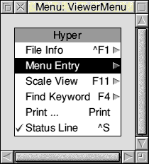
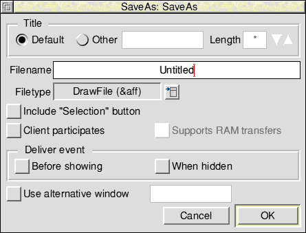
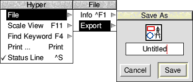
As an example, consider adding an export DrawFile facility. This would allow saving away the Draw files that make up the card on show in the viewer. The best way to implement this would be:
This can be achieved easily by some very simple editing of the resource file:
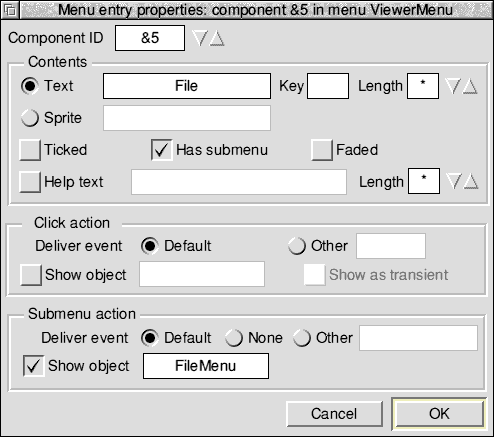
Now edit the new menu entry and rename it to File. Then drag the new menu object template FileMenu to the Show object option:
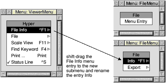
Moving the File Info menu entry from ViewerMenu to the new File submenu is a very simple way of relocating this menu option from one menu to another. As we rely on the FileInfo_AboutToBeShown event, it doesn't matter where it is in the interface; it will still work.
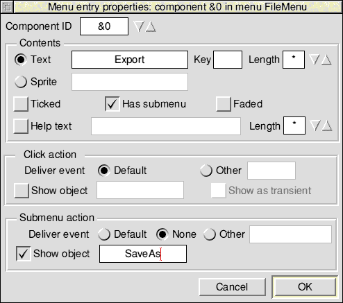
The final submenu should now appear as follows:
The code for the export facility would consist of registering for the various toolbox events and then handling them in a separate area of the code.
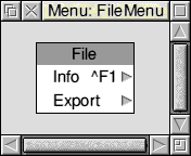
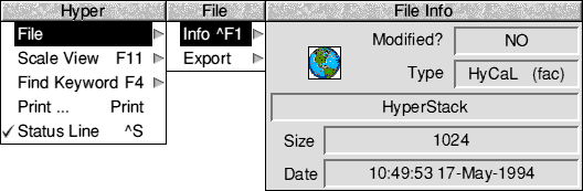
If you now dragged the resource file to ResTest, you would see:
By this time the viewer menu could begin to get cluttered. It would then be very easy to drag off some of the entries to a separate 'Utilities' submenu. Again, being event driven and remembering that the handlers operate on the Ancestor of the menu tree, they will continue to work without code alteration.
Making a demo version of Hyper could be achieved by removing or fading parts of the interface with !ResEd.
A number of events were used in Hyper that were 'Client specified'. These are listed here to help understand properties and output in !ResEd and !ResTest.
| Event number | Usage |
|---|---|
| &101 | Go to Home card |
| &103 | Go to previous card |
| &150 | Start find operation |
| &151 | Iconbar menu is about to be shown |
| &900 | Viewer menu is about to be shown |
| &901 | Toggle status bar |
Other standard events were enabled for dialogues being shown, Print etc.
This chapter has demonstrated the following features of the toolbox:
| Toolbox feature | see section/file |
|---|---|
| shared objects and client handles | Shared objects and client handles |
| About to be shown events | AboutToBeShown events |
| adding and removing gadgets at run-time | button.c (see Implementing hotspots) |
| creating objects from a template | view.c (see Redraw handler) |
| auto creation | AboutToBeShown events |
| the Draw file renderer | draw.c (see Redraw handler) |
| event handling with eventlib | Coding |
| Menu handling | Creating a basic resource file |
| keyboard short-cuts | Adding keyboard short-cuts |
| client specified events and component ids | Showing and hiding views |
HyperCard Control Language (HCL) is used by !Hyper to control which draw files are displayed to the user and when jumps should be made to new cards. It is beyond the scope of this example to describe an editor, so the following section is provided to describe the commands that are used.
All card definitions are enclosed within start and end directives:
!!start
name
...
where name is cardXXXXXXXX, XXXXXXXX being an 8 digit hex number.
Other commands are as follows:
There are also a number of commands that are only used by an editor. These are not described here as they are not required by !Hyper.