
|
www.riscos.com Technical Support: |
ResEd is the tool used to construct and edit Toolbox resource files. It provides the following:
To use this chapter you should have a basic understanding of the Toolbox and objects.
The process for creating, editing, and saving a resource file can be summarised as follows:
The following section, Creating and editing a Toolbox resource file, gives a detailed description of the above process.

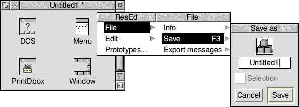
Start ResEd in a similar way to other RISC OS applications, by double-clicking on its application icon. It loads and installs an icon on the iconbar. It may also be loaded by double-clicking on a file of type Resource, in which case the file is loaded and displayed.
Each resource file is displayed in its own resource file display. If you load a file which is already loaded, that file's window is raised to the top of the window stack.
Whenever a resource file is loaded, a corresponding Sprites file is sought in the same directory. If one is found its sprites are loaded with *iconsprites and used when displaying the resources in the resource file display. Sprite files may also be loaded by dragging to the iconbar icon.
The iconbar icon responds to the mouse in the following ways:
Empty resource files are opened with incrementally-unique names (Untitled1, Untitled2 etc). Each one is opened in a slightly different position to the last.
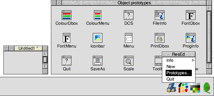
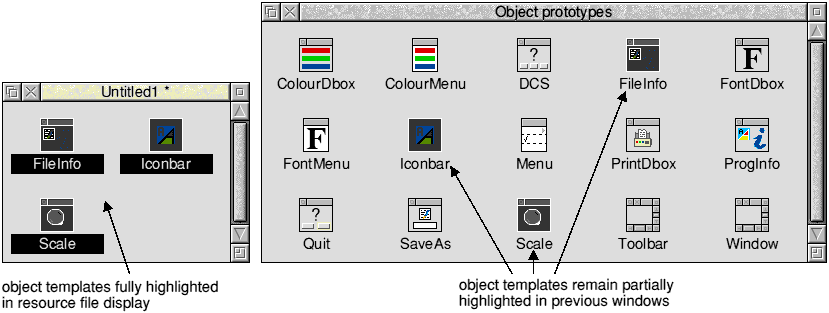
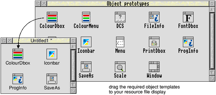
The object prototypes window contains prototype object templates of each class. You can drag these into the resource file display in order to populate it with object templates. The object prototypes window is fully described in The object prototypes window.
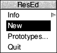
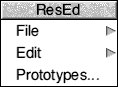
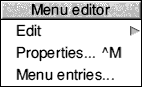
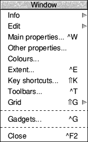
Clicking Menu on the iconbar icon displays the following menu:
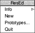
Info displays an Info dialogue box.
New opens an empty, untitled resource file display.
Prototypes... opens the object prototypes window (described on The object prototypes window).
Quit exits the program.
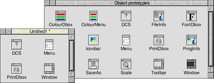
Resource file displays may be populated with object templates by dragging them in from the object prototypes window. The templates are named after the classes they represent. You can copy them into your resource file display by drag and drop, rename them as desired, and then view and edit them by double-clicking on their icons.
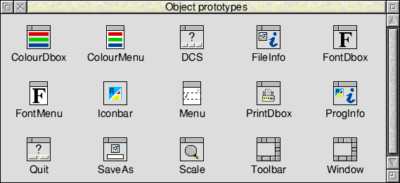
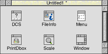
The following object templates are available:
| Colour Dbox | Colour menu | DCS Dbox | File Info Dbox |
| Font Dbox | Font menu | Iconbar icon | Menu |
| Print Dbox | Prog Info Dbox | Quit Dbox | Save As Dbox |
| Scale Dbox | Toolbar | Window |
To open or raise the object prototypes window, choose Prototypes... from the iconbar menu or click Adjust on the iconbar icon. The object prototypes window is very similar to an ordinary resource file display, but attempts to move, rename, modify or delete object templates within it are ignored. It is not possible to edit an object template within the object prototypes window; instead you must first drag the object template into a resource file display. The object prototypes window does not have a menu and only Ctrl-Z and Ctrl-A keyboard short-cuts are available.
The resource file display is Filer-like, in that it contains a grid of icons, one per object template held in the resource file. The sprite associated with each icon is a pictorial clue as to the type of object template that icon represents; each class of object template has its own sprite. The text associated with each icon is the name assigned to that object template.
Icons may be selected, deselected and dragged from one resource file display to another (as in the Filer).
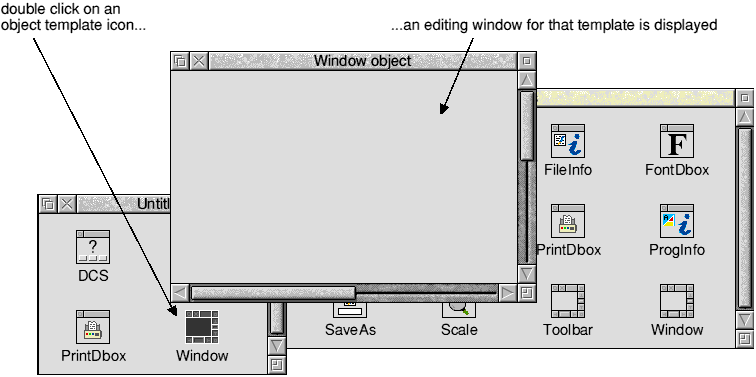
To edit an object template, double-click on its icon. A window will then open for that object template. Some common features of editing object templates are described in Editing object templates in general.
For details of editing the individual types of object templates see
You can copy object templates between resource file displays by dragging their icons. You can also make a copy of an object template within one resource file display by using Shift-Drag Select.
You can move an object template from one resource file display to another using Shift-Drag Select. This will remove the object template from the source window.
Note: Copy or move operations that would result in duplicate names are resolved by the new object templates' names being automatically disambiguated by the addition of a unique numeric suffix (you will be warned if this happens).
If you drag a selection into a different application, the result is the exporting of a resource file containing just the selected object templates. This file is named Selection.
If the resource file display is the target of a drag and drop or DataSave interaction from another application, it checks the file type and rejects the file if not of type Resource or Text (for more information on text files see Exporting and importing messages). Resource files are imported into the resource file display and object template names are disambiguated if necessary, as described above. Importing a file does not alter the filename of the destination resource file display - the name of the incoming file is simply ignored.
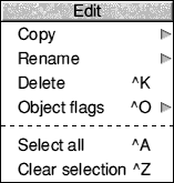
Clicking Menu on the resource file display shows the ResEd menu:
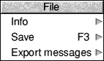
Info leads to a File Info dialogue box.
Save leads to a Save as dialogue box, which includes a Selection button for saving only the selected object templates.
Export messages leads to a Save as dialogue box allowing you to produce a text file containing all the user-visible messages for the file (or selection, if Save selection is set). The messages may then be edited (typically, translated into a different language) and then re-imported by dropping the file back into the resource file display.
For more information about exporting and importing messages see Exporting and importing messages.
Copy (which is shaded unless only one object template is selected) leads to the following dialogue box:
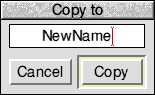
The name field is filled in with the name of the selected object template. To make a copy of the object template in the same file, alter the name and click Copy.
Rename leads to a dialogue box with a writable icon for entering a new name for the selected object template and a Rename button to accept the change:
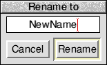
The writable icon is initially filled in with the current name. When Rename is pressed, the object template is renamed unless a name clash would occur, in which case an error message is issued instead.
You can also change an object template's name by clicking Alt-Select inside the icon's name, editing the string and pressing Return:
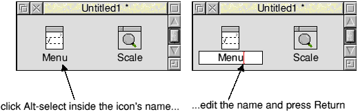
Pressing Escape or clicking outside the writable icon cancels the rename.
Delete deletes all the selected object templates.
Object flags allows you to edit the settings of the object flags for the selected object templates. See The Object flags dialogue box for more details.
Select all selects all the object templates in a resource file display.
Clear selection deselects all the selected object templates.
This option displays the object prototypes window.
You can edit most object template data by double-clicking on its icon. There is, however, a 32-bit flags field in the object header. These flags are applicable to all classes of object, and you may view the flags of an individual object template by selecting it and entering the Object flags dialogue box. It has the following appearance:
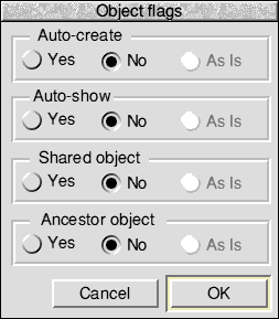
| Bit | Meaning when set |
|---|---|
| 0 | create object when resource file is loaded |
| 1 | show object as soon as it is created |
| 2 | object is shared |
| 3 | mark this as an Ancestor object |
If there is one object template selected, or multiple object templates which have identical flag values, the buttons will be set to Yes or No as appropriate. If there are multiple selected object templates with different flag settings, then the flags which differ will be set to As Is, indicating to the user that the flag value differs across the object templates.
You may adjust the settings as required, and on pressing OK the new flag values will be applied to the selected object templates. Any flags which are set to As Is will not be applied to the selected object templates; each object template will retain its existing value for those flags. So, for example, you could change a number of object templates to be 'Shared' without altering their other flags.
Once you have dragged an object template from the Objects prototype window into the resource file display you can edit it by double-clicking on its icon. You can then edit a properties box for that object template specifying how you want it to appear and behave. All the object properties boxes share the following features.
The Window and Menu object templates, and all gadget templates, include the facility to specify a help message:

If you switch on the Help text option you are then able to enter a help message into the associated message field:

By default an asterisk is displayed in the Length field. This asterisk ensures that, whatever string you enter into the message field, the exact length of that string (including its terminator) will be passed to the Toolbox.
Alternatively you can manually change the size of the Length field to be greater than the length of the help message itself. This is useful if you wish to alter the help message at run-time. If you type a number into the Length field directly, then, when you click on OK, the size of the Length field will be set to the length of the string you entered +1 (unless the number you entered is greater than the length of the string, in which case the number will remain as you entered it).
The following are some points to bear in mind when entering help text:
Some other options in object properties boxes behave in a similar manner to the above; for example, editing the Titles of objects.
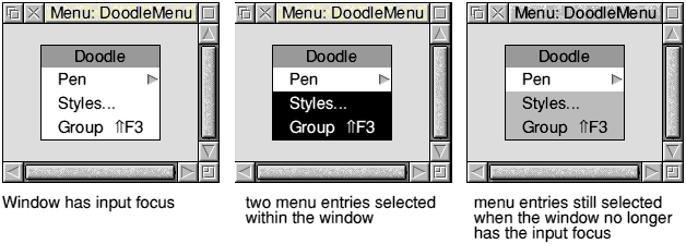
ResEd supports some new selection techniques to improve the way you can manipulate objects and object templates.
ResEd provides two levels of selection with two corresponding types of highlight:
For example, when you select one or more object templates in the object prototypes window and drag them to a resource file display, the original object templates remain partially highlighted. This allows you to return to the object prototypes window and, by clicking on any of the object templates within the original selection, automatically select all of the original selection. For example:
You can use this additional selection technique throughout ResEd; for example, you can select menu entries when editing a Menu object template, and still retain them as a selection if you temporarily need to edit a different window:
If you use the mouse to drag a Select box around a group of object templates, you can control whether all the objects (even those partly) within the box are selected, or just the ones wholly within the box:
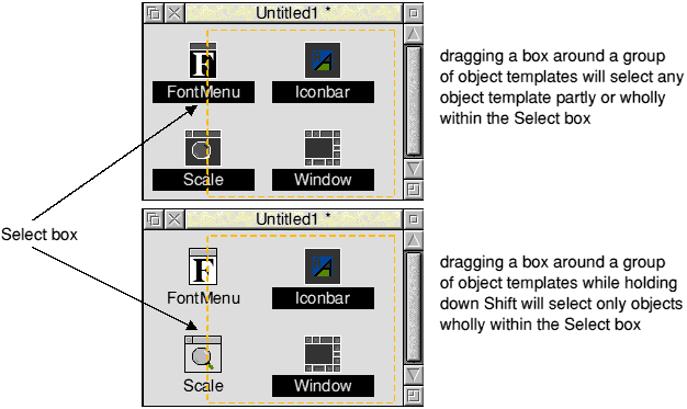
Groups of gadgets (in the Window editor) or groups of menu entries (in the Menu editor) can be selected in a similar way.
Clicking Cancel (or pressing Escape) will close the dialogue box without making any changes.
Clicking Adjust Cancel (or pressing Shift-Escape) will leave the dialogue box displayed but will remove any changes made since opening the box.
Clicking OK (or pressing Return) will close the dialogue box and include any changes in the object template.
Clicking Adjust OK (or pressing Shift-Return) will leave the dialogue box displayed and update all changes made since opening the box (e.g. if you increased the contents of a help message field, the Length field would then be increased automatically).
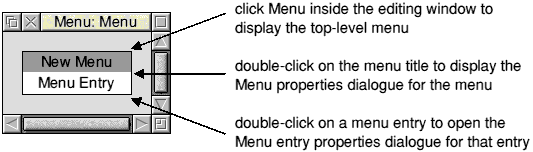
Double-clicking on a menu object template in the resource file display will display a Menu editing window with the following appearance:
The editing window displays the menu as it will appear when displayed by the Toolbox.
Clicking Menu inside the editing window displays the following menu:
Edit leads to the Edit submenu.
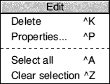
Delete deletes the selected menu entries.
Properties... opens the Menu entry properties dialogue box for the selected menu entry (see Editing a Menu entry).
Select all selects all the menu entries in the menu.
Clear selection deselects all the menu entries in the menu.
Properties... displays the Menu properties dialogue box, described in Editing the Menu.
Menu entries... displays the Menu entries window, described in Inserting a new Menu entry.
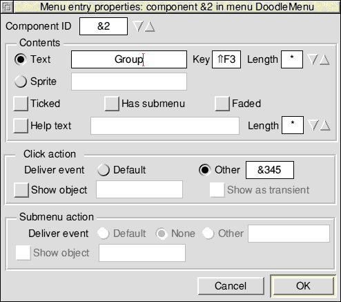
This is a dialogue box for viewing and editing the characteristics of a menu entry. You can open it by selecting a menu entry in the editing window and then selecting Properties... from the Edit menu (or by double-clicking on a menu entry):
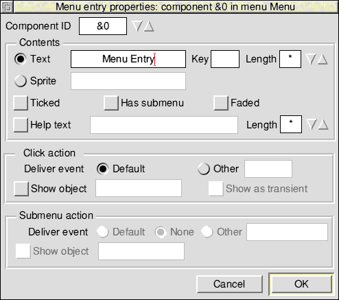
Component ID is a text field containing the hexadecimal component identifier of this menu entry. Normally there is no need for you to edit this field as the component identifiers are automatically assigned. If you wish to assign identifiers yourself, you must ensure that they are unique within each menu.
Note: Clicking OK while any component ids are the same will elicit an error message and the dialogue box will stay open until this is sorted out.
Text and Sprite determine the contents of the menu entry:
If you select Text, you can then enter the text and keyboard short-cut to be displayed, and the maximum permissible length for the entry's text to be set to at run-time.
If you want to enter a keyboard short-cut into the Key field manually, you may have to use !Chars to display short-cuts such as Shift F3. It is more advisable to create a keyboard short-cut first (in the Keyboards shortcut dialogue box), and then drag this short-cut to the menu entry properties dialogue box.
This process is fully described in Using a keyboard short-cut entry to 'fill in' a menu entry.
If you select Sprite, you may then enter the name of a sprite to be displayed.
Ticked displays a tick next to this entry.
Has Submenu controls whether the entry has a submenu arrow.
Faded displays this entry in grey; when the menu is shown by an application the entry will be unselectable.
The writable field next to Help text allows you to supply a suitable interactive help string for the Toolbox to send to !Help when the mouse pointer is over this menu. If Help text is switched off, the Toolbox will instead supply any help text associated with the menu as a whole - see Editing the Menu).
The Click action section specifies what happens when the user selects this menu entry. The first thing that will happen is that the application will receive an event:
Selecting Default specifies that you will receive the default event (Menu_Selection).
Selecting Other allows you to receive whichever event you specify in the associated writable field (the event can be entered as a hex number, e.g. '&345', or as a decimal number).
After the event has been delivered, you can specify whether an object will be shown automatically. You can do this by turning on the Show object option and entering the name of the object to be shown in the associated writable field.
The Submenu action section is very similar, and specifies what should happen when the user traverses the submenu arrow of this entry. (The section is faded unless the Has Submenu option has been selected). The text fields have the same meanings as for menu selection. The default event in this case is Menu_Submenu.
The two Show object name fields may be filled in by dragging an object template's icon from the resource file display into the appropriate text entry field (or onto the corresponding option icon if the text entry field is shaded).
This is a dialogue box for editing the top-level characteristics of a menu. It is opened from the Edit menu or by double-clicking on the menu's title:
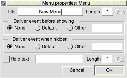
The Title field contains the text shown at the head of the menu.
Note: If a Menu with no title is shown, the Wimp will not display a title bar. This is not Style Guide compliant, but the Menu editor allows this so that you can set a title at run-time.
Deliver event before showing controls the following:
Deliver event when hidden controls the following:
The writable field next to Help text allows you to supply a suitable interactive help string for the Toolbox to send to !Help when the mouse pointer is over this menu (if Help text is switched off, the Toolbox will not reply to such HelpRequest messages).
You can insert new menu entries into the menu using the Menu entries window. The Menu entries window is opened by selecting Menu entries... from the top-level menu.
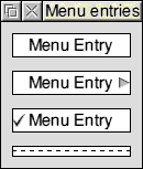
The Menu entries window contains a dotted line separator and three prototype menu entries:
The menu entries in the Menu entries window may be dragged with the mouse and dropped over the menu area to insert new menu entries and separators. The new entry is placed between two existing entries according to the vertical position of the drop point. If the mouse pointer is within the menu's title, it is inserted after the title; if it is dropped after the final entry it is appended at the bottom.
You can copy a menu entry from one part of a menu to another using Shift-Drag Select. The insertion point is determined as for inserting a new item. New menu entries are automatically assigned unique component ids within the menu.
You can also use Drag Select to copy menu entries between editing windows.
You can move menu entries between different Menu editing windows using Shift-Drag Select. The selected entries are deleted from the source window.
You can re-order menu entries using Drag Select. The insertion point is determined as for inserting a new item.
Note: If a copy or move operation results in a menu containing two entries with the same component id, the editor forces the newly inserted one to have a unique id.
This example shows you how you might create the three menu entries in the following typical menu:
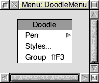
The first menu entry in the above example (Pen) has an associated submenu, so the Menu entry properties box could be filled in as follows:
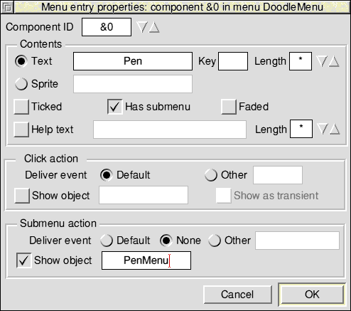
The minimum sections to edit in the Menu entry properties box are
You would then create another menu object template and give it the name 'PenMenu'. This object would be displayed when the user traverses the submenu arrow.
The second menu entry in the above example (Styles...) has an associated dialogue box, so the Menu entry properties box could be filled in as follows:
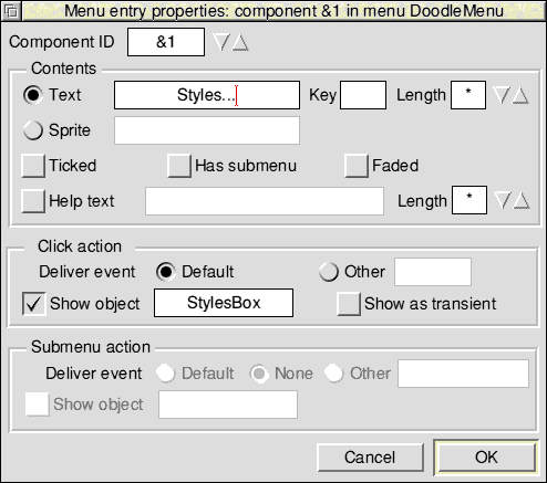
The minimum sections to edit in the Menu entry properties box are as follows:
You would then create a window object template for the dialogue box and give it the name 'StylesBox'. This object would be displayed when the user clicks on Styles...
Note: Any object (e.g. submenus and dialogue boxes) can also be built dynamically at run-time by the client application (see Attaching a submenu dynamically).
The third menu entry in the above example (Group ![[UP]](../../symbols/entities/8657.png) F3) returns an event if the user clicks on the entry or uses a keyboard short-cut (Shift F3); this would allow the client application to perform an appropriate action on receipt of the event.
F3) returns an event if the user clicks on the entry or uses a keyboard short-cut (Shift F3); this would allow the client application to perform an appropriate action on receipt of the event.
Creating this keyboard short-cut requires two stages:
The first stage is to define the keyboard short-cut within the window object template itself. For example:
For more information on keyboard short-cuts see Keyboard short-cuts.
The next stage is to open the third menu entry and give it a unique name (i.e. 'Group'), and then drag the keyboard short-cut to it. This will automatically fill in:
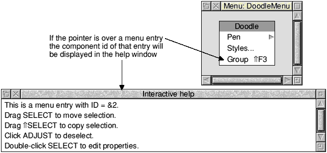
The Help window gives you information about the Menu window and also displays the component id of an individual menu entry:
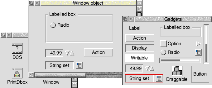
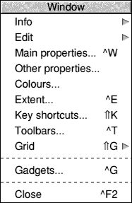
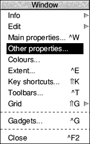
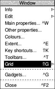
Double-clicking on a window object template in the resource file display will display an editing window. This window displays the window object template as it will appear (complete with gadgets) when displayed by the Toolbox. It has the following appearance:
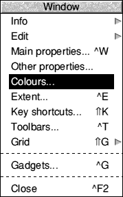
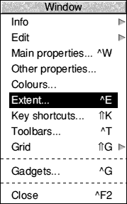
Info leads to an Info box showing the object template's name.
Edit leads to the Edit submenu for the selected gadget(s).
See The Edit submenu.
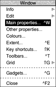
Main properties... opens the Main window properties dialogue box. This box allows you to specify those properties.
See The Main properties dialogue box for more details.
Other properties... opens the Other window properties dialogue box. This box allows you to edit those properties of a window object template that you would normally only specify once.
See The Other properties dialogue box for more details.
Colours... opens the Window Colours dialogue box.
See Window Colours for more details.
Extent... opens the Window Extent dialogue box.
See Window Extent for more details.
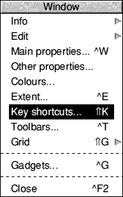
Key shortcuts... opens the Keyboard short-cuts dialogue box. This allows you to define keyboard short-cuts for use inside the window.
See Keyboard short-cuts for more details.
Toolbars... allows you to attach toolbar object templates to this window. See Toolbar object template for more details.
Grid leads to the Grid dialogue box. This allows you to display an optional grid of alignment points to assist in the uniform placement of gadgets.
See The Grid for more details.
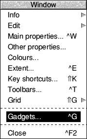
Gadgets... opens, or brings to the front, the gadgets window. This is a selection of gadgets which may be dragged into a Window object template to populate it with gadgets. See The gadgets window for more details.
Close closes the window and incorporates any changes.
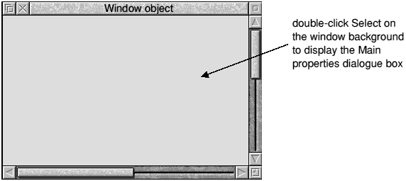
This dialogue box allows you to edit the main properties of a window object template. The name of the window object template that the dialogue box refers to is displayed in the titlebar. Choose Main properties... from the Window menu or double-click Select on the window background to display this box:
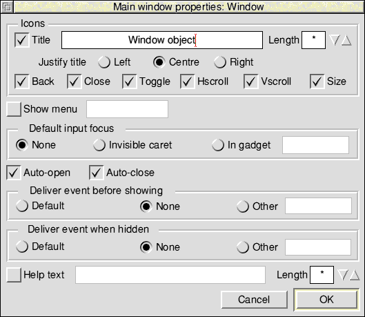
Icons controls the following features:
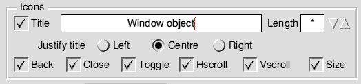
Title allows you to enter the title of the window within the title bar. If you switch this option off the window will not have a title bar.
Note: The window title is always a vertically-centred, indirected text icon in system font; there is no facility to set a validation string.
Justify title allows you to specify the justification of the title within the title bar.
The Back, Close, Toggle, Hscroll, Vscroll and Size option buttons control whether the Back icon, Close icon, Toggle Size icon, Horizontal scroll bar, Vertical scroll bar and Adjust size icons are displayed.
Show Menu is an option button that controls whether the window has a menu attached to it. If this is switched on, the associated writable field is unshaded for the menu object template's name to be entered. Alternatively the field can be filled in by dropping a menu object template onto it (or onto the corresponding option icon if the field itself is shaded).
Default input focus allows you to set the characteristics of the default input focus for the window.
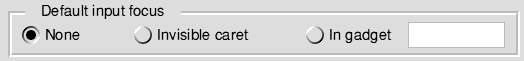
None specifies that the window has no input focus and no caret.
Invisible caret specifies that the window has input focus, but no caret is displayed until the user clicks in an appropriate area.
In gadget specifies that the window has input focus and the caret is displayed inside a gadget. You can enter the component id of the gadget in the adjoining field or drag a gadget to the field (or to the corresponding radio button if the field itself is shaded).
Auto-open controls whether the Window module automatically (re-)opens the window when a Wimp_OpenWindowRequest event is received.
Auto-close controls whether the Window module automatically closes the window when a Wimp_CloseWindowRequest event is received.
Deliver event before showing controls the following:
Deliver event when hidden controls the following:
The writable field next to Help text allows you to supply a suitable interactive help string for the Toolbox to send to !Help when the mouse pointer is over this window (if Help text is switched off, the Toolbox will not reply to such HelpRequest messages).
The above controls are described in the Window Manager chapter in Volume 3 of the RISC OS 3 PROGRAMMER'S REFERENCE MANUAL_ AND IN THE Window class.
This dialogue box allows you to edit those properties of a window object template that you would normally only specify once. You can only display this box by choosing Other properties... from the Window menu:
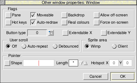
Flags controls the following features:
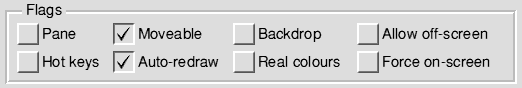
Pane specifies that the window is a pane.
Moveable determines if the window is moveable, i.e. it can be dragged by the user.
Backdrop, if selected, does not allow any other windows to be opened below this one.
Allow offscreen allows the window to be opened or dragged outside the screen area (regardless of the Configure option settings).
Hot keys allows events to be generated for hot keys.
Auto-redraw specifies that the window can be redrawn entirely by the Wimp, i.e. there are no user graphics in the work area.
Real colours specifies that the window colours should be treated as GCOL numbers instead of standard Wimp colours.
Force on-screen forces the window to stay on screen.
Note: Old-style window flags are not supported (i.e. bit 31 of the window flags word is always set).
Button type determines how the Wimp will deal with mouse movements and clicks over the window's background. There are 16 possible types which can be selected from the Pop-up menu (see the RISC OS 3 Programmer's Reference Manual entry for Wimp_CreateIcon for more details).
Extendable X ignores the right-hand extent if the Adjust size icon of the window is dragged.
Extendable Y ignores the lower extent if the Adjust size icon of the window is dragged.
User scroll controls the Scroll_Request event:
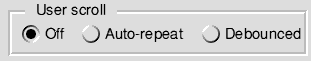
Off does not return a Scroll_Request event.
Autorepeat returns a Scroll_Request event when a mouse button is clicked on one of the arrow icons (with auto-repeat) or in the outer scroll bar region (no auto-repeat).
Debounced returns a Scroll_Request event when a mouse button is clicked on one of the arrow icons (but with no auto-repeat) or in the outer scroll bar region (no auto-repeat).
Sprite area controls whether sprites are located in the client area or the Wimp sprite area.
Shape is an option button that controls whether the mouse pointer should change shape when it is over the window. If this is switched on, the associated writable fields are unshaded for the pointer sprite's name, its length, and the coordinates of its hotspot to be entered.
You can use the icons around the window object template to manipulate the window's size, position and scroll offsets. This information is saved with the template. The stacking position is not saved; all templates are saved with a stacking position of -1 (top of stack) unless the window's Backdrop flag is set, in which case the position is -2 (bottom of the stack).
You can resize windows which have no scrollbar using Ctrl-Shift-Drag Adjust. The window can only be resized subject to the constraints of its current work area extent.
You can move windows which have no title bar using Ctrl-Shift-Drag Select.
The window's Close icon, if present, may be used to close the window. The window may also be closed by using the Close menu option, or by the keyboard short-cut Ctrl-F2.
This dialogue box allows you to edit the colours of a window:
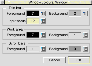
The display fields contain the Wimp colour number of the chosen colour, and have their backgrounds set to that colour. The menu buttons invoke a pop-up menu offering a choice of the 16 Wimp colours. The menus for Titlebar: Foreground and Work area: Background also offer the choice Transparent.
An alternative form of this dialogue box is displayed if the window object's Real colours flag has been set (see The Other properties dialogue box). In this case the pop-up menus are not available and the colour display fields are replaced by writable icons; values in the range 0 to 255 may be entered.
This dialogue box allows you to edit the extent (work area size) of a window:
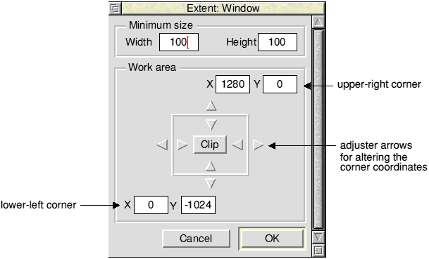
The Work area is represented by two pairs of x,y coordinates for the lower-left and upper-right corners. You may adjust these coordinates by typing into the adjoining writable fields, or using the adjuster arrows on the 'adjustable square'.
Clicking on the Clip button causes the size of the work area to be made equal to the window's current visible area on your screen.
Width and Height allow you to enter the size below which the window may not go.
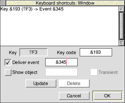
Each window may have a list of keyboard short-cuts associated with it. These are programmable mappings from Wimp key codes to Toolbox events. When a keystroke event is delivered, the Window module checks to see if it is in the list of short-cuts for the window containing the caret. If so, it delivers the associated event to the application. Alternatively (or additionally), a keyboard short-cut may be associated with an object template which specifies an object to be shown when the keystroke happens.
The keyboard short-cuts assigned to a window may be created and modified using the Keyboard shortcuts dialogue box. The name of the window that the dialogue box refers to is displayed in the titlebar:
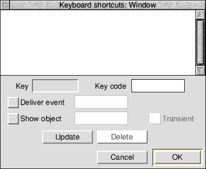
Existing keyboard short-cuts are displayed in the scrolling area. Double-click on one of them to load its details into the icons below for editing; alternatively simply type in the details of the new one.
Key is a special icon which allows you to define a key code by pressing the corresponding key(s) on the keyboard. First click Select on the icon to activate it and then press the key combination. The corresponding code appears in the Key code field, and a description of the key appears in the Key field. Note that Shift-Ctrl-letter combinations are not allowed.
Key code is the Wimp keycode for the event as described in the RISC OS 3 Programmer's Reference Manual entry for Wimp_Poll. This code is displayed automatically when you enter a key press into the Key field, or you may specify it yourself as a decimal number or a hex number (by preceding it with &).
Deliver event selects whether the keystroke will generate an event. The associated writable field allows you to enter the event code as a decimal or hex number.
Show object selects whether the keystroke should show an object. The associated writable field allows you to specify the name of the object template to be shown.
Transient causes the object to be shown with transient behaviour.
Update adds the new keyboard short-cut to the scrolling list, replacing any short-cut for the same key already present.
Delete deletes the selected short-cuts from the list. The short-cuts listed in the scrolling list can be selected for deleting by clicking on them (Adjust toggles whether the short-cut is selected or not).
OK accepts the updated list of short-cuts and closes the window.
Cancel closes the window, discarding any changes.
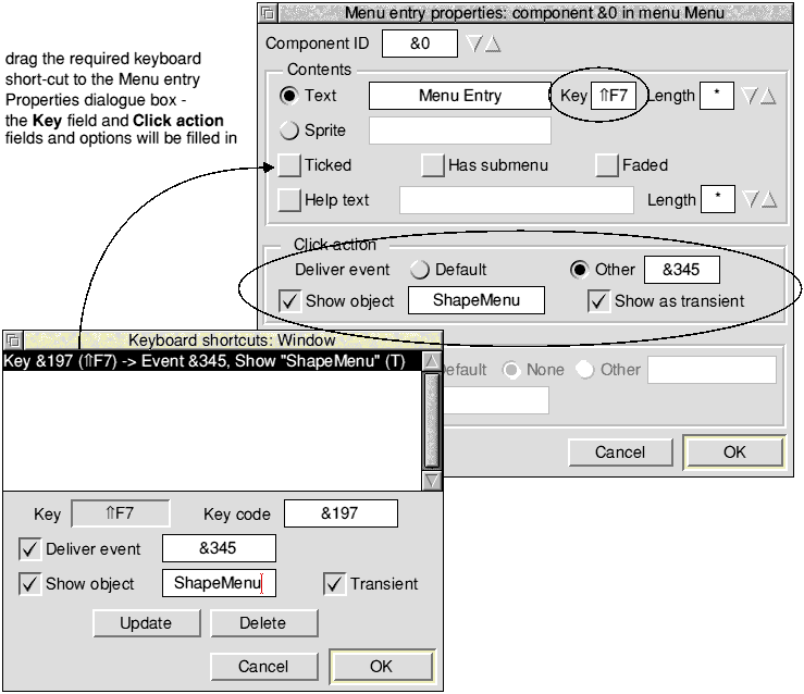
You can fill in the Key field and Click action fields (Deliver event, Show object and Show as transient) in a menu entry by dragging a keyboard short-cut entry from the Keyboard shortcuts scrolling area and dropping it into a Menu entry properties dialogue box in the Menu editor:
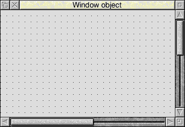
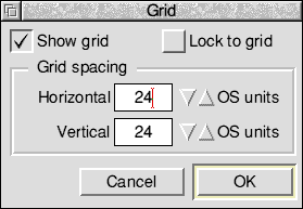
The Grid dialogue box can display an optional grid of alignment points to assist in the uniform placement of gadgets:
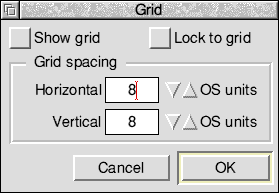
The grid is represented by a matrix of dots which overlay the contents of the window. The grid spacing is specified as a number of OS Units between grid points, this being configurable independently for different windows.
Show grid controls whether the grid is currently displayed for this window.
If Lock to grid is selected, gadgets may only be moved or resized in units of grid spacing. This means that if you have a group of gadgets then you can move (or resize) them, either horizontally or vertically, in multiples of the selected grid spacing, and they will keep their relative positions.
Note: If you drag gadgets into a window, the gadgets will not be locked to the grid in the window until you use the Snap to grid option (see Snap to grid).
Grid spacing controls the spacing of the grid. For maximum compatibility across different RISC OS modes you are advised to set grid spacings to exact multiples of 8, and to this end the adjuster arrows alter the grid spacing in steps of 8. Values that are not a multiple of 8 may be entered from the keyboard but will be forced to be exact multiples of 4. For example:
There is also an option that allows you to snap gadgets to grid points. This is described in Snap to grid.
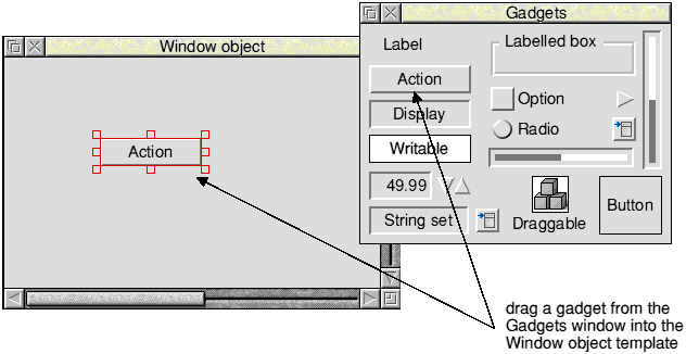
You can populate a window with gadgets by dragging them in from the gadgets window. This is a read-only window containing a typical example of each supported gadget type. You can display the gadgets window by choosing the Gadgets... option from a Window menu (or by pressing Ctrl-G):
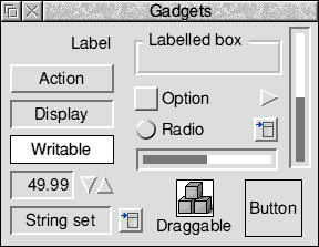
The gadgets in the gadgets window may not be moved or deleted. The gadgets window does not have a menu, and only the keyboard short-cuts ^A and ^Z are available.
You can drag any of the gadgets from the gadgets window into your window object template and drop them wherever is appropriate.
You can reposition one or more gadgets in your window by first selecting them and then using Drag-Select with the pointer over one of the selected gadgets. If Lock to grid is on, the gadgets are moved by the nearest multiple of the grid spacing. If you hold down Shift, a copy of the gadgets is made.
There are three ways to position a gadget accurately:
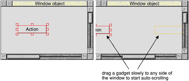
If you want to move a gadget beyond the visible area of the window on the screen you must drag the gadget very slowly towards one of the sides of the window. Auto-scrolling of the window will occur when the mouse pointer comes close to a side of the window; scrolling is faster the closer the pointer is to the edge.
You can copy gadgets between windows by dragging them from one window object template to another (to avoid auto-scrolling you should not drag a gadget too slowly when dragging between windows).
If you hold down Shift the gadgets are deleted from the source window.
You can move a gadget in one direction only using Drag-Adjust on the top, bottom, left or right resize handles (if Lock to grid is switched on, the gadgets are moved by the nearest multiple of the grid spacing):
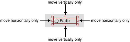
You can change the size of a gadget using Drag-Select on a resize handle (if Lock to Grid is on the change in size of the gadget (or selection of gadgets) is always a multiple of the grid spacing).
You can also change the size of one gadget, or of a selection of gadgets, using the Width and Height options in the Coordinates dialogue box (see The Coordinates dialogue).
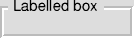
Gadgets are not intended to be stacked; so there are no facilities for placing one gadget 'above' another. Gadgets whose bounding boxes overlap will stack in an arbitrary order; there is no way you can guarantee that this order will remain unchanged. The exception to this rule is the labelled box gadget, which is always placed beneath all other gadgets.
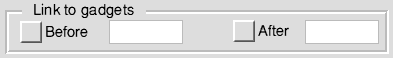
You can define the order in which the caret is moved between writable gadgets (in response to the Tab, Shift-Tab, up-arrow and down-arrow keys) by filling in the Before and After fields of the gadget properties dialogues:
These fields contain the component ids of the two gadgets 'before' and 'after' the gadget. To help you fill these in, you can drag gadgets into them, or more typically you can use the Link writables option in the Edit submenu. This automatically fills in these fields for all the selected gadgets that support caret movement (writable fields, string sets and number ranges). The ordering imposed is left-to-right and top-to-bottom (as if you were reading a page of text).
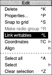
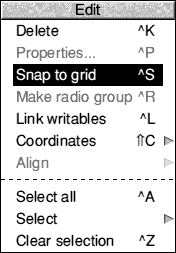
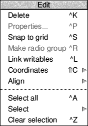
If you select one or more gadgets then, depending on the gadgets selected, some of the following edit options in the Edit submenu will be available:
Delete deletes the selection of gadgets.
Properties... opens the gadget properties dialogue box for the selected gadget. An alternative way to open this dialogue box is to double-click Select on the gadget itself.
Snap to grid snaps selected gadgets to the window grid (see Snap to grid). Note that this option is independent of the Lock to grid setting, and is operative even when the grid points are not displayed.
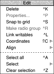
Make radio group makes any selected radio buttons into a radio group (see Manipulating radio groups).
Link writables links the selected writable gadgets together so that they can be traversed with Tab, Shift-Tab, up arrow and down arrow keys (see Moving the caret between writable gadgets).
Coordinates allows gadget coordinates to be entered from the keyboard for precise positioning (see The Coordinates dialogue).
Align allows you to align gadgets with one another (see The Align menu).
Select all selects all the gadgets in the window.
Select leads to the Select submenu.
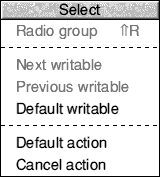
Radio group selects all the radio buttons in the radio group to which the selected radio button belongs (see Manipulating radio groups).
Next writable selects the gadget that is linked after the selected gadget.
Previous writable selects the gadget that is linked before the selected gadget.
Default writable selects any gadget that is assigned as the 'default input focus' for the window.
Default action selects any action button that is assigned as the default action button.
Cancel action selects any action button that is assigned as the cancel action button.
Clear selection deselects all the gadgets in the window.
The Snap to grid operation on the Edit submenu makes each selected gadget move so that its alignment point is on the nearest gridpoint.
The 'alignment point' of a gadget is as follows:
(the only exception is the label gadget; where the alignment point is on the lefthand side if the label is left-justified, on the righthand side if the label is right-justified, and in the centre if the label is centre-justified)
Snap to grid snaps each selected gadget independently (when the selection is moved under grid-lock, the relative positions of the gadgets are preserved).
If you drag a selection of gadgets into a window they will not be snapped to the grid in that window (even if Lock to grid were switched on). If they were snapped automatically to the grid it would alter their relative positions to each other, and this might not be desired. The gadgets remain selected when dragged into a window, so if you do want to snap them to the grid then you can just press Ctrl-S (for Snap to grid).
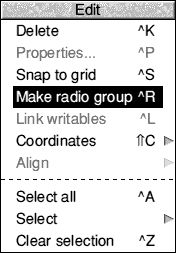
When you drag radio buttons into a Window object template from the gadgets window, each one ends up in its own new radio group. You must then select and group them explicitly using the Make radio group option in the Edit menu.
The Make radio group option is faded unless the window's selection consists entirely of radio buttons. When you choose this menu entry, the selected radio buttons are placed into a single new radio group.
To select all members of a radio group, press Menu over one of them and choose Radio group from the Select submenu in the Edit menu. This enables you to see instantly the grouping relationship between radio buttons.
When a radio button is copied within a window by use of Shift-Drag, the copy is put into the same group as the original. So the easiest method to create a radio group is to drag a single radio button into the Window object template and make multiple copies of it using Shift-Drag Select.
Adding radio buttons to a window never adds them to a pre-existing group; but any radio groups added to a window remain as groups.
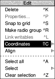
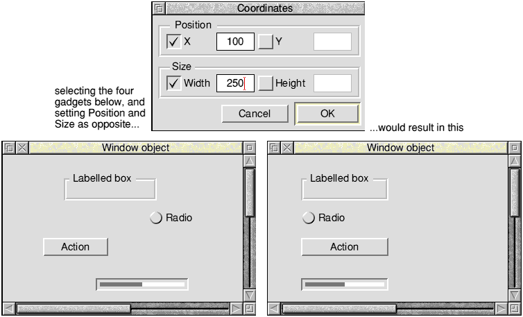
This dialogue box allows you to position or size selected gadgets by entering coordinates (in the window's work-area coordinate system) from the keyboard:
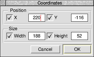
When a single gadget is selected, all four option buttons are switched on and the four writable fields are filled in with its position and size.
If you select more than one gadget, they are checked to see if they have common values for any of the four attributes. Those attributes with common values are filled in, and the corresponding option buttons switched on. Those attributes with differing values are faded, and the corresponding option buttons switched off. You may toggle the option buttons to alter the settings of any of the latter attributes.
When you click OK, the attributes are set from those fields with the option buttons switched on. The attributes that have their option buttons off are left alone. Thus, it is possible to set several gadgets to have the same X position without altering their Y positions, and at the same time equalise the width of the selected gadgets:
The Align menu allows you to align a group of selected gadgets in a window
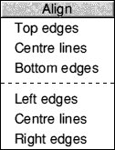
The gadgets are then moved to align with the nominated gadget.
If you press Menu when the pointer is not over a gadget the Align menu will be faded. Lock to grid is ignored when aligning.
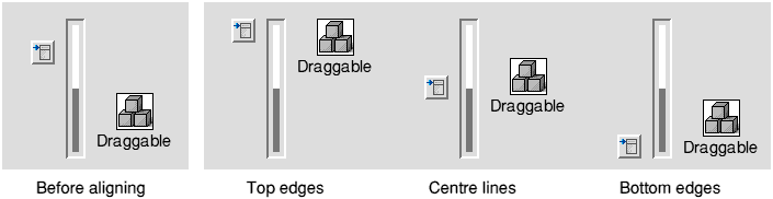
The top three options control how the gadgets will be aligned from top to bottom. In the following example the gadgets are aligned with the slider gadget:
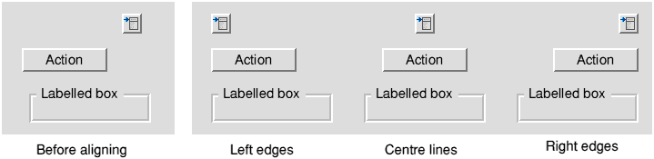
The bottom three options control how the gadgets will be aligned from left to right. In the following example the gadgets are aligned with the Labelled box gadget:
The toolbar object prototype is a window object template. Double-clicking on it inside a resource file display will display a blank editing window:

You can then edit this window, move it round the screen (using Ctrl-Shift-Drag Select), change its size (using Ctrl-Shift-Drag Adjust) and colour, drag gadgets into it etc, in exactly the same way as you would edit a window object template.
Once you have finished designing your toolbar you can open a window object template, go into the window menu for that template, and select the Toolbars... option. This will display the following box:
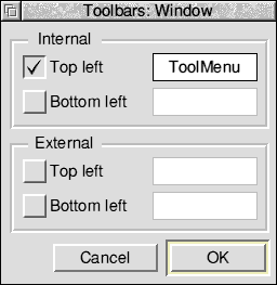
You can enter a toolbar object template name into a writable field after switching on the corresponding option icon (e.g. to the right of Top left), or drop a toolbar object template onto the writable field (or onto the associated option icon if the writable field is faded).
The Help window displays the id, size and position of a gadget in a window.
In the following example, a window has been customised as a Find dialogue box and the pointer has been moved over two of the gadgets in the window:
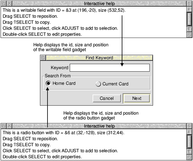
The customised window shown above is described in Adding a find capability in the User Interface Toolbox manual.
Some features are common to several or all gadget properties boxes. These are described here rather than repeating their descriptions in each gadget section:
You can open the properties dialogue box for a gadget by double-clicking on the gadget in the Window editor.
The following sections describe in detail the layout and extra controls of each type of gadget properties dialogue:

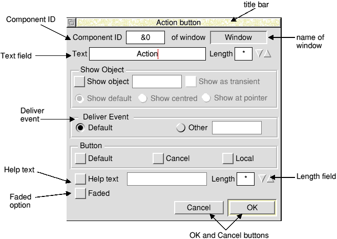
The action button properties box is displayed as follows:
The Show object option controls whether pressing this button should cause another object to be shown automatically. You can enter the object template's name into the associated writable field, or drag the object template into this field (or onto the associated option icon if the field is faded). This mechanism may be used to make nested dialogues.
Show as transient selects whether the object will be shown as a transient or not.
The Button section allows you to specify the operation of the action button.
Default controls whether this button is the default for the window it is in. If you select it, the button is given a highlighted border and is activated by any presses of the Return key within its window.
Cancel controls whether this button is the cancel button for the window it is in. If this is selected, all clicks on the button cause the window to be closed. Also any Escape key presses when the parent window has the caret cause the Cancel button to be activated.
When you make an action button into the Default or Cancel button for its window, that attribute is removed from the button that previously had it.
If you drag an action button into another window, the editor checks that the strictures regarding Default and Cancel buttons are not violated (that there must be at most one of each). If necessary the previous 'owners' of these attributes are made into normal action buttons.
Whenever the Default attribute is added to an action button, its bounding box is automatically enlarged to include the special border, and when the attribute is removed, the bounding box is made correspondingly smaller.
Local makes an action button into a Local action button. Unlike a normal action button, activating it will not cause the parent window to be closed.

The adjuster arrow properties box is displayed as follows:
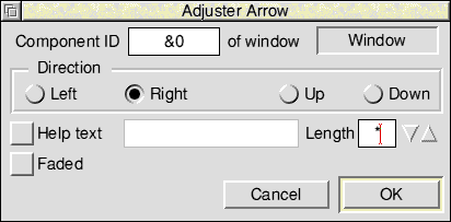
The Direction radio buttons control the direction that the arrow button is pointing in, and hence whether the button will return 'up' or 'down' events.

The Button gadget exposes most of the underlying Wimp icon, allowing you to create custom controls. The Button properties box is displayed as follows:
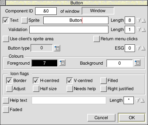
Text and Sprite are option buttons controlling the contents of the icon. By switching the two buttons on or off, or just switching one of them on, you can produce four combinations. The effects of these various combinations are described in the RISC OS 3 Programmer's Reference Manual on page 3-101. If necessary you can then specify a validation string in the Validation field. Note, however, that if you only switch on Sprite, then the pointer must be to a sprite name.
Use client's sprite area specifies that the Toolbox should first check on those areas set up by Toolbox_Initialise, rather than using the default Wimp Sprite area.
Return menu clicks specifies that a Menu click is returned to the client application (instead of being processed and acted upon by the Toolbox).
Button Type is a string set offering the sixteen possible Wimp button types:
| 0 | Never |
| 8 | Double/Drag |
| 1 | Always |
| 9 | Menu icon |
| 2 | Auto-repeat |
| 10 | Double/Click/drag |
| 3 | Click |
| 11 | Radio |
| 4 | Release |
| 12 | Type 12 |
| 5 | Double click |
| 13 | Type 13 |
| 6 | Click/Drag |
| 14 | Write/Click/Drag |
| 7 | Release/Drag |
| 15 | Writeable |
ESG is a writeable field for the input of the icon's Exclusive Selection Group number. This number is constrained to be between 0 and 31.
Foreground and Background offer the choice of the sixteen standard Wimp colours from a pop-up menu. The associated display field shows the chosen colour, as well as the Wimp colour number in a contrasting colour.
The option buttons under Icon flags are used to set the remaining icon flag bits that are not implicitly defined by the above settings. The correspondence between buttons and icon flag bits is as follows (see the RISC OS 3 Programmer's Reference Manual entry for Wimp_CreateIcon for more details):
| Button | Bit |
|---|---|
| Border | 2 |
| H-centred | 3 |
| V-centred | 4 |
| Filled | 5 |
| Adjust | 10 |
| Half size | 11 |
| Needs help | 7 |
| Right justified | 9 |
There are three icon flag bits that are pre-set which you cannot change:
| Bit | Set to |
|---|---|
| 6 | always set to system font |
| 8 | always indirected |
| 21 | always unselected when first displayed |

The display field properties box is displayed as follows:
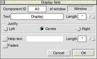
The Justify radio buttons are used to choose whether the contents are positioned to the left, right or centre of the gadget.

The draggable properties box is displayed as follows:
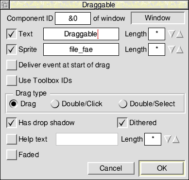
The Draggable gadget may have a writable text string, a sprite, or both, as chosen by relevant option buttons. At least one of these must be on.
The Deliver event at start of drag option allows you to control delivery of the Draggable_DragStarted event.
Use Toolbox IDs allows you to specify that object/component id pairs of the drag destination will be reported, rather than Wimp window handle/icon handle pairs.
The Drag type radio buttons allow you to select the behaviour of the draggable.
Drag provides drag behaviour equivalent to dragging a standard Save As box.
Double/Click is equivalent to Icon button type 10.
Double/Select is equivalent to Icon button type 8.
Has drop shadow allows you to specify whether the draggable has a grey drop shadow when dragged.
Dithered allows you to specify whether the draggable is displayed as semi-transparent when dragged.

The label properties box is displayed as follows:
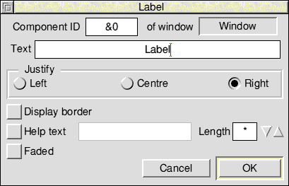
The Justify radio buttons are used to choose whether the contents are positioned to the left, right or centre of the gadget.
Display border controls whether the gadget's bounding box is drawn or not.
The labelled box properties box is displayed as follows:
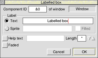
The labelled box can have either a textual or sprite label, but not both. This is chosen using the Text and Sprite radio buttons. The text entry field next to the unselected radio button is faded.
Filled allows you to specify that the background to the sprite is set to grey.

The number range properties box is displayed as follows:
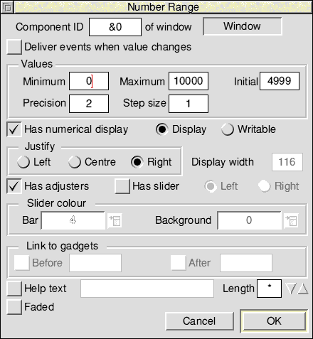
Deliver events when value changes controls whether the application receives NumberRange_ValueChanged events when the contents of the writable change.
Initial, Minimum, Maximum and Step Size are writable fields in which you specify the main parameters of the number range. They are always specified as integers.
Precision controls the display of a decimal point; its value is the number of digits to be displayed to the right of the point (thus if precision is 2, the value 2.34 is specified as 234). To display integers, set Precision to 0.
Has numerical display controls whether any numbers are displayed.
Display and Writable select whether the display area may be typed into. If Writable is on, the Link to gadgets section allows you to specify which gadgets the caret should be moved to when the Tab, Shift Tab, up-arrow and down-arrow keys are pressed. If you drag a gadget into the Before or After writable fields (or their associated option icons) its component id is entered into the field automatically. Normally, however, you would use the Link writables option in the Edit menu to determine the path taken by the caret. See Moving the caret between writable gadgets for more details.
The Justify radio buttons are used to choose whether the numeric value is positioned to the left, right or centre of the numerical display field.
Display width allows you to specify the width (in multiples of 4 OS units) of the field that displays the number (only if Has slider is switched on).
Has adjusters controls whether adjuster arrows are displayed; if selected, they will appear as a pair of buttons to the right of the display area (or, if there is a slider, at either end of the slider).
Has slider controls the presence and positioning of the gadget's associated slider. The slider is always placed 8 OS units away from the display area, and may be to the left or right of it. The slider will be interactive only if the writable radio button is selected.
The Slider colour section allows you to specify the colours of the slider:
Bar is a display field showing the colour of the slider's bar. The colour is set by specifying a Wimp colour number from the attached pop-up menu.
Background is a display field showing the background colour of the slider's bar. The colour is set by specifying a Wimp colour number from the attached pop-up menu.
As well as the normal eight resize handles, number range gadgets which display a slider and numerical display have an additional handle. You can drag this handle to the left or right to adjust the size of the numerical display field:
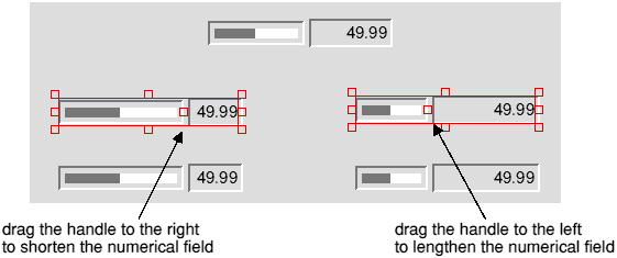
Note: You can only alter the size of the numerical field on one number range gadget at a time. If you try and resize this field on a selection of number range gadgets only the gadget you are actually resizing will be resized.

The option button properties box is displayed as follows:
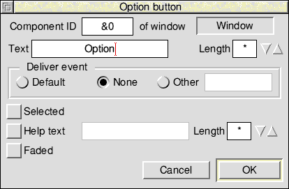
Selected chooses whether this button is initially switched on or not.

The pop-up menu properties box is displayed as follows:
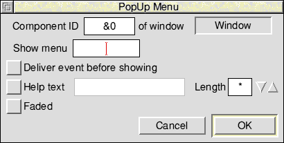
Show menu controls whether a menu will be automatically shown when the menu button is clicked. The template name of the menu to be attached may be filled in by dragging a Menu object template to this field. If no Menu object template is supplied, the application will be expected to create it at run-time in response to the PopUp_MenuAboutToBeShown event.
Deliver event before showing controls whether the client application will receive a PopUp_MenuAboutToBeShown event when the object is about to be shown.

The radio button properties box is displayed as follows:
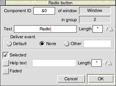
Each radio button is a separate gadget and belongs to a 'radio group', this group being the set of radio buttons with which it is mutually exclusive. The radio group is implemented by means of a 'Group Number' (see Radio buttons) in the Toolbox data structure that describes the gadget; the group number is not the same as the Wimp's ESG (which the Toolbox does not use). You cannot specify the group number explicitly, instead you must use the Make radio group option in the Edit menu; however, the group number assigned by ResEd is always displayed in the in group field.
Selected chooses whether the button is initially on or off; only one button in the group may be on at once, and switching another on will turn off the previously-on button.
The slider properties box is displayed as follows:
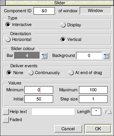
The Type radio buttons select between a read/write slider and a read-only one.
The Orientation radio buttons select whether the slider is horizontal or vertical. When a slider's orientation is changed, it is rotated through 90 degrees about its centre point.
Slider colour Bar is a display field showing the colour of the slider's bar. The colour is set by specifying a Wimp colour number from the attached pop-up menu.
Slider colour Background is a display field showing the background colour of the slider. The colour is set by specifying a Wimp colour number from the attached pop-up menu.
The Deliver events buttons control when the application will receive Slider_ValueChanged events.
Minimum and Maximum are the signed integer bounds of the slider's range.
The Initial value and Step size are constrained to be valid given the current minimum and maximum settings.
The string set properties box is displayed as follows:
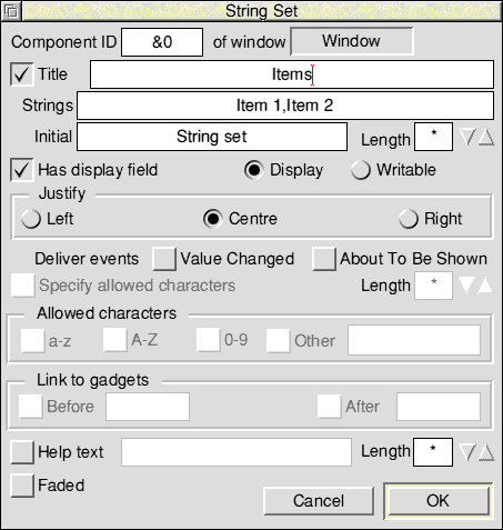
To set up a string set, enter the list of available strings into the Strings writable field. The list is comma-separated; to include a comma in one of the strings, precede it with a backslash. To include a literal backslash, use two backslashes.
The Initial writable field is for entering the string whose value will be used as the initial contents of the string set. This string does not have to be one of the list of available strings.
Has display field controls whether any text is displayed.
Display and Writable select whether the display area may be typed into. If Writable is switched on, the display area of the string set will be writable and the user may enter any desired string into it - not just one of the predetermined choices. Switching on Writable also enables you to fill in the Specify allowed characters section.
The Justify radio buttons are used to choose whether the contents are positioned to the left, right or centre of the display area.
Deliver events Value Changed controls whether the application receives StringSet_ValueChanged events when the contents of the writable change.
Deliver events About To Be Shown controls whether the client application will receive a StringSet_AboutToBeShown event when the object is about to be shown.
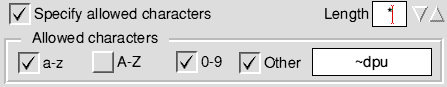
The Specify allowed characters section allows you to specify what characters may be typed into the display area. If you do not switch on this option any character will be accepted (before you can fill in the Specify allowed characters section you must first switch on Writable).
Length determines the size of buffer allocated to the validation string.
Allowed characters accepts a pattern for the characters that should be allowed in the gadget.
For example, if you wanted to specify that the only characters allowed were the digits 0-9 and the lower-case letters a-z, except for 'd', 'p' and 'u', you would fill this section in as follows:
The Link to gadgets section allows you to specify which gadgets the caret should be moved to when the Tab, Shift Tab, up-arrow and down-arrow keys are pressed. If you drag a gadget into the Before or After writable fields (or into the associated option icon if the writable field is faded) its component id is entered into the field automatically. Normally, however, you would use the Link writables option in the Edit menu to determine the path taken by the caret. See Moving the caret between writable gadgets for more details.

The writable field properties box is displayed as follows:
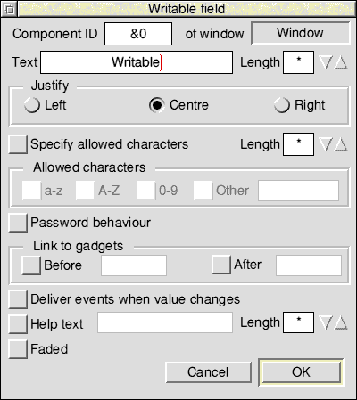
The Justify radio buttons are used to choose whether the contents are positioned to the left, right or centre of the gadget.
The Specify allowed characters section allows you to specify what characters may be typed into the display area. Length determines the size of buffer allocated to the validation string. Allowed characters accepts a pattern for the characters that should be allowed in the gadget as for the Wimp's icon validation string 'A' command. For a full description of allowed characters see the section on allowed characters on the previous page.
If Password behaviour is switched on, then any characters entered will be displayed as minus signs.
The Link to gadgets section allows you to specify which gadgets the caret should be moved to when the Tab, Shift Tab, up-arrow and down-arrow keys are pressed. If you drag a gadget into the Before or After writable fields (or into the associated option icon if the writable field is faded) its component id is entered into the field automatically. Normally, however, you would use the Link writables option in the Edit menu to determine the path taken by the caret. See Moving the caret between writable gadgets for more details.
Deliver events when value changes controls whether the application receives WritableField_ValueChanged events when the contents of the writable change.
There are three stages in editing any of the remaining object templates.
In general the editing dialogue boxes for these remaining object templates are not WYSIWYG representations of the underlying objects.
Some features are common to several or all standard dialogue boxes or standard menus. These are described here rather than repeating their descriptions in each individual section:
Title is the title string to appear in the title bar of the dialogue box or menu. If this is set to Default, the module will provide a suitable default. If it is set to Other, the accompanying writable fields are unfaded for you to specify an initial title and its maximum length.
Deliver event controls the following:
Before showing controls whether the client application will receive a DialogueAboutToBeShown event when the object is about to be shown.
When hidden specifies that the client application will receive a DialogueCompleted event when the object is hidden.
Use alternative window is an option button which controls the availability of the writable field next to it. If the option is switched on, you may enter the name of a Window object template to be used as the prototype for creating the relevant object template, instead of the standard one (alternatively you can drag a window object template icon from the resource file display into the writable field - or into the associated option icon if the writable field is faded). This enables any standard dialogue or menu to be given a custom appearance. The custom window must contain gadgets similar to those used in the default module window; see the relevant chapter on the particular module for details.
Every dialogue box and menu has OK and Cancel buttons.
The Colour Dialogue object template is displayed as follows:
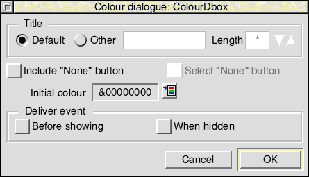
Include "None" button is an option button that decides whether the dialogue will allow the choice of 'no' colour.
Select "None" button specifies that the None button is selected by default.
Initial colour is a display field that shows the RGB value of the selected colour. Next to it is a pop-up button which summons a colour picker from which the initial colour may be chosen.
The Colour Menu object template is displayed as follows:
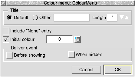
Include "None" entry is an option button that controls the presence of an entry for 'no colour' (i.e. None) on the menu.
The Initial colour display field shows the initially-ticked colour, and the pop-up menu to the right of it is itself a colour menu enabling the initial colour to be chosen. The option icon controls whether any value is ticked or not.
The DCS (Discard, Cancel, Save) object template is displayed as follows:
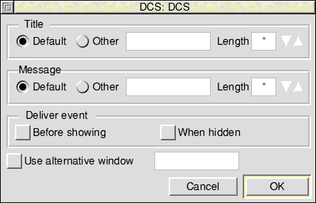
Message is a writable field for entering the message to be displayed in the centre of the window. Its behaviour is similar to that of the Title field.
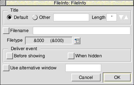
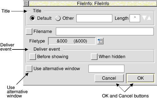
The File Info object template is displayed as follows:
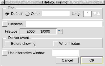
Filename is a writable field containing the initial contents of the filename display.
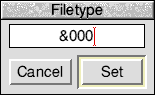
Filetype is a display field showing the initial filetype's name and hex value. Next to it is a pop-up menu button which displays a list of filetypes for you to choose from. If you want to specify a filetype not on this list you can go to the Filetype dialogue box (via the Other menu option) and fill in the writable field with any filetype name or number. The number must be in decimal unless preceded with '&'. The two special filetypes 'directory' (&1000) and 'application' (&2000) may also be entered.
Note that no interface is provided for setting the 'filesize', 'modified' and 'date' fields of the File Info object template because these cannot be known when the template is being created. They must be filled in by the application at run-time.
The Font Dialogue object template is displayed as follows:
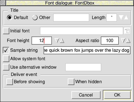
Initial font is a writable field for you to type in the initial font name to be put into the font dialogue. Alternatively, you can select a font from the pop-up menu next to the writable field. Note that it is possible that the initial font will not be available at run-time; if so, a default will be substituted by the module (as will be the case if the option icon is not switched on).
Font height is a number range giving the initial contents of the object's font height setting. You can change the integer value using the adjuster arrows, or type a new value in yourself.
Aspect ratio is a number range giving the initial contents of the object's aspect ratio setting. You can change the integer value using the adjuster arrows, or type a new value in yourself.
Sample string is a writable field that lets you specify the test string to be displayed when the Font Dialogue's Try button is pressed. If the option icon is not switched on, the module will substitute a default.
The Allow system font option button controls whether System Font will be selectable using the Font Dialogue object.
The Font Menu object template is displayed as follows:
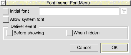
Initial font is a writable field for you to type in the initial font name. Alternatively, you can select a font from the popup menu next to the writable field. Note that it is possible that the initial font will not be available at run-time; if so, a default will be substituted by the module (as will be the case if the option icon is not switched on).
The Allow system font option button controls whether System Font will be on the menu. If you switch this option on, the Initial font menu has System Font on it too.
The Iconbar icon object template is displayed as follows:
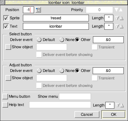
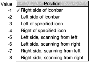
Position and Priority control where on the iconbar the icon will appear. You can select the position from the adjoining pop-up menu or enter a value directly into the writable field.
They are also incompatible with the object's auto-show bit being set, as they depend on a Wimp icon handle being specified in the call to Toolbox_ShowObject. The editor does not force this bit to be clear in these cases; the effect of setting it is undefined.
Sprite name is a writable field where you can enter the name of the sprite to be displayed in the icon. If the icon is to display text as well, you should switch on the Text option button. This unfades the two writable fields next to it, enabling you to enter the initial string and maximum length. Switching this option button on sets bit 0 of the object's flags word.
Grouped under Select button and Adjust button are the controls for specifying what should happen when the user clicks on the icon with the appropriate mouse buttons:
Deliver event is a writable field for the input of an event code to be delivered to the application.
Show object is a writable field that takes the name of an object template to be shown. You can enter the name of the object template by typing or by dragging an object template into the writable field (or into the associated option icon if the writable field is faded). It is possible to ask for both an event to be delivered and an object to be shown.
The Transient option selects whether the object will be shown as a transient or not.
Deliver event before showing controls whether the client application will receive an Iconbar_DialogueAboutToBeShown event when the object is about to be shown.
Show menu is a writable field for you to specify the name of a menu to be shown when the user clicks in the icon with the Menu mouse button. If the associated option button is turned off, the field is faded and no menu will be shown. You can enter the name of the menu by dragging a Menu object template from the resource file display into the writable field (or into the associated option icon if the writable field is faded).
The writable field next to Help text allows you to supply a suitable interactive help string for the Toolbox to send to !Help when the mouse pointer is over the object. If Help text is switched off then no help text will be sent.
The Print Dialogue object template is displayed as follows:
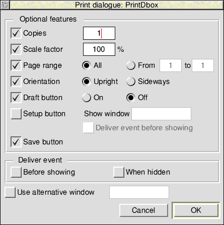
Listed under Optional features are a number of option buttons that select which of the optional controls will be present on the dialogue box. Some of these option buttons control the availability of further parameters.
Copies selects whether the dialogue box will allow the user to specify the number of copies to be printed. If this is selected, the writable field to its right is unfaded for the initial value of the number of copies to be specified.
Scale factor selects whether the dialogue box will allow the user to specify a scale factor for the print job. If this is selected, the writable field to its right is unfaded for the initial value of the scale factor to be specified.
Page range selects whether the dialogue box will allow the user to specify the range of pages to be printed. If you switch this option on, the two radio buttons to its right are unfaded for you to specify the default page range. Selecting All means that the default will be for all pages to be printed. Selecting From means that only a specified range of pages will be printed; this range is specified using the two writable fields (which are faded until From is selected.)
Orientation selects whether the Print dialogue box will include a choice of Upright (portrait) or Sideways (landscape) mode. The radio buttons to the right of it are faded unless you switch on this option, and enable you to choose what the default orientation will be.
Draft button selects whether the Print dialogue box has a Draft option button or not. The associated radio buttons choose the initial state of the Draft button.
Setup button selects whether the dialogue box has a Setup button. If you switch this option on, the fields underneath and to the right are unfaded to enable the specification of the following parameters:
Show window is the name of the Window object template to be used for the Setup dialogue. You can enter this by typing, or by dragging a Window object template into the writable field (or into the associated option icon if the writable field is faded).
Deliver event before showing is an option button that controls whether a Print_SetUpAboutToBeShown event will be delivered before the Setup dialogue is shown.
Save button selects whether the Print dialogue box has a Save action button for saving the current printing setup.
The Prog Info object template is displayed as follows:
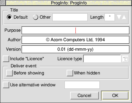
Purpose, Author and Version are writable fields that allow you to specify the contents of the corresponding parts of the Prog Info dialogue box.
Include "Licence" is an option button which controls whether the Prog Info dialogue box has a Licence type field. If you switch on this option, you can select the licence type from the pop-up menu next to the writable field. The licence types available are Public domain, Single user, Single machine, Site, Network and Authority.
The Quit Dialogue object template is displayed as follows:
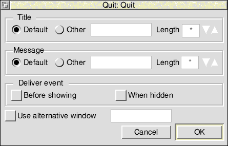
Message is a writable field that allows you to enter the message to be displayed in the centre of the window. Its behaviour is similar to that of the Title field.
The Save As object template is displayed as follows:
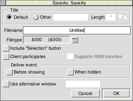
Filename is a writable field for you to enter the default filename to be displayed in the dialogue.
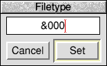
Filetype is a display field showing the current filetype's name and hex value. Next to it is a pop-up menu button which displays a list of filetypes for you to choose from. If you want to specify a filetype not on this list you can go to the Filetype dialogue box (via the Other menu option) and fill in the writable field with any filetype name or number. The number must be in decimal unless preceded with '&'.The two special filetypes 'directory' (&1000) and 'application' (&2000) may also be entered.
Include "Selection" Button is an option button that allows you to control the presence or absence of the Save As dialogue's Selection option.
If the Client participates option button
The Scale Dialogue object template is displayed as follows:
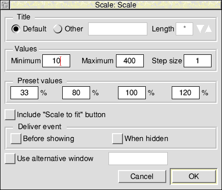
Minimum, Maximum and Step size are writable integer fields for entering the constraints to be placed on user-specified scale factors.
Preset values is a list of four writable fields allowing you to specify the scale factors on the preset size local action buttons.
Include "Scale to fit" button is an option button that allows you to control the presence or absence of a Scale to fit action button in the Scale Dialogue object.
For some purposes, especially internationalisation, you may want to edit the user-visible messages held in a resource file en masse. Rather than manually stepping through every object template in the file, it is useful to be able to edit all the messages in one place. You can do this using the Export messages menu item (see The File menu). This menu item leads to a Save as box containing a Textfile icon. If you drag this icon into a Filer window or a text editor, ResEd generates a file of messages in MessageTrans format (see the RISC OS 3 Programmer's Reference Manual for details).
The file produced contains the messages from each object template in turn. Because these do not have specific tags, a unique tag is generated automatically for each message. These tags take the form:
<object name>|<number>:
where
<object name> is the name of the object template
<number>      is the number of the message within that object
You can then edit the resulting message file, and drag it back into the resource file display. A warning is displayed, and you must click on Import to proceed.
The messages are matched to their respective objects by use of the information stored in the tags. So, for example, the message
SetColours|5:This is the setcolours dialogue
will replace the fifth message in the object template whose name is 'Setcolours'. This means that you should take extra care when editing a resource file after its messages have been exported, and before they have been imported back again. Objects should not be renamed, and gadgets within window object templates must not be deleted. On the other hand it is safe to add new templates, or to add new gadgets, or move existing gadgets within a window.
Note: it is important that you do not alter any of the tags while editing the messages.
When revised messages are imported, to an object that is currently being edited it is forcibly re-loaded to ensure that its editor is kept up-to-date with the changes. Thus there is potential for you to lose changes made while editing, so care should be exercised when importing message files. Indeed, it is best, before exporting or importing messages, to ensure that there are no unconfirmed changes in any dialogue boxes associated with the file.
On occasions, it can be quicker when you are working in ResEd to use the keyboard instead of the mouse, especially when you are familiar with ResEd.
| Keystroke | Effect |
|---|---|
| Ctrl-O
F3 | open the Object flags dialogue box for the selected objects
display a Save As dialogue box |
| Keystroke | Effect |
|---|---|
| Ctrl-W | open the Main properties dialogue box |
| Ctrl-E | open the Extents dialogue box |
| Shift-K | open the Keyboard shortcuts dialogue box |
| Ctrl-T | open the Toolbars dialogue box |
| Ctrl-G | open the Gadgets dialogue box |
| Ctrl-P | open the properties dialogue box for the selected gadget |
| Shift-C | open the Coordinates dialogue box for the selected gadget |
| Shift-G | open the Grid dialogue box |
| Ctrl-S | snap the selected gadgets to the grid |
| Ctrl-R | make the selected radio buttons into a radio group |
| Ctrl-L | link the selected writable gadgets together |
| Ctrl-F2 | close this window |
| Shift-R | show all members of the radio group to which the selected radio button belongs |
| Keystroke | Effect |
|---|---|
| Ctrl-M | open the Menu properties dialogue box for editing the top-level characteristics of a menu |
| Ctrl-P | open the Menu entry properties dialogue box for the selected menu entry |
| Keystroke | Effect |
|---|---|
| Ctrl-A | select all entries, gadgets or objects |
| Ctrl-K | delete selected entries, gadgets or objects |
| Ctrl-Z | clear current selection |
The following mouse actions work on individual menu entries, gadgets or object templates or selections of the same.
Object prototype windows, gadget windows and menu entry windows behave in the same manner as described below, except that, as they are non-editing windows, they do not allow operations such as deletion or repositioning.
| Mouse action | Effect |
|---|---|
| Double-click | on a gadget to open its properties dialogue box |
| Drag Select | on a gadget to move it around the window
or to copy it from one window to another or on the resize handle of a gadget to resize it |
| Drag Adjust | on the resize handle of a gadget to move it in one direction only |
| Shift-Drag Select | on a gadget to make a copy of it within the window
or move it from one window to another (deletes the original) |
| Ctrl-Shift-Drag Select | on a window (with or without a titlebar) to move it around the screen |
| Ctrl-Shift-Drag Adjust | on a window (with or without an Adjust size icon) to change its size |
| Mouse action | Effect |
|---|---|
| Double-click | on a menu entry to open its properties dialogue box |
| Drag Select | on a menu entry to reposition it within the list of menu entries
or to copy it from one menu to another |
| Shift-Drag Select | on a menu entry to make a copy of it within the list of menu entries
or move it from one menu to another (deletes the original) |
| Mouse action | Effect |
|---|---|
| Double-click | on a window, toolbar or menu object template to open its editor
on any other object template to open its properties dialogue box |
| Drag Select | on an object template to copy it from one resource file display to another |
| Shift-Drag Select | on an object template to make a copy of it within the resource file display
or move it from one resource file display to another (deletes the original) |
The mouse can be used in two ways to select a group of object templates:
Groups of gadgets (in the Window editor) or groups of menu entries (in the Menu editor) can be selected in a similar way.